Context & Challenge
Civic tech at scale
Civic organizations often juggle spreadsheets for contacts, separate apps for calling, and paper lists for door-to-door work. Democratik set out to put those workflows in one platform that could scale from local chapters to national parties.
The hard part was not only visuals. Organizations need complex permissions, multi-tenant setups, dense data for power users, and simple mobile flows for volunteers.
When I joined as Associate Designer, V2 worked but felt dated: inconsistent patterns, weak mobile support, and flows that did not match how organizers work in the field.
- CRM, campaigns, telephony, and field tools in one product
- Multi-tenant setup with role-based permissions
- Users ranging from admins to door-to-door volunteers
 After (V3)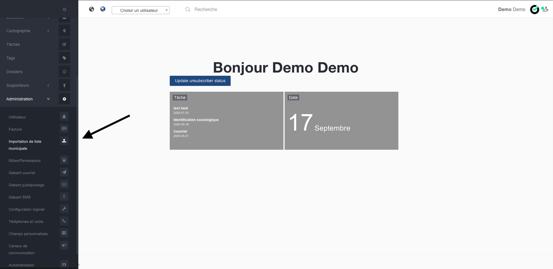
Research & Discovery
Understanding organizers in the field
I worked with product stakeholders and client organizations to map existing workflows: how contact lists were imported, how call scripts were built, and how canvassing results returned to the CRM.
Field work showed a clear split. Campaign managers at desks needed dashboards and filters. Mobile volunteers needed fast lookup, scripted interactions, and flows that tolerate poor connectivity.
That shaped our priorities: fewer steps to start a canvass, supporter history at the point of contact, and campaign status that is visible without digging through menus.
- Workflow mapping with stakeholders and field teams
- Split personas: admin vs. field volunteer
- Fewer steps on the tasks people do most often
V2 to V3 Evolution
Reference points, not a portfolio of V2 work
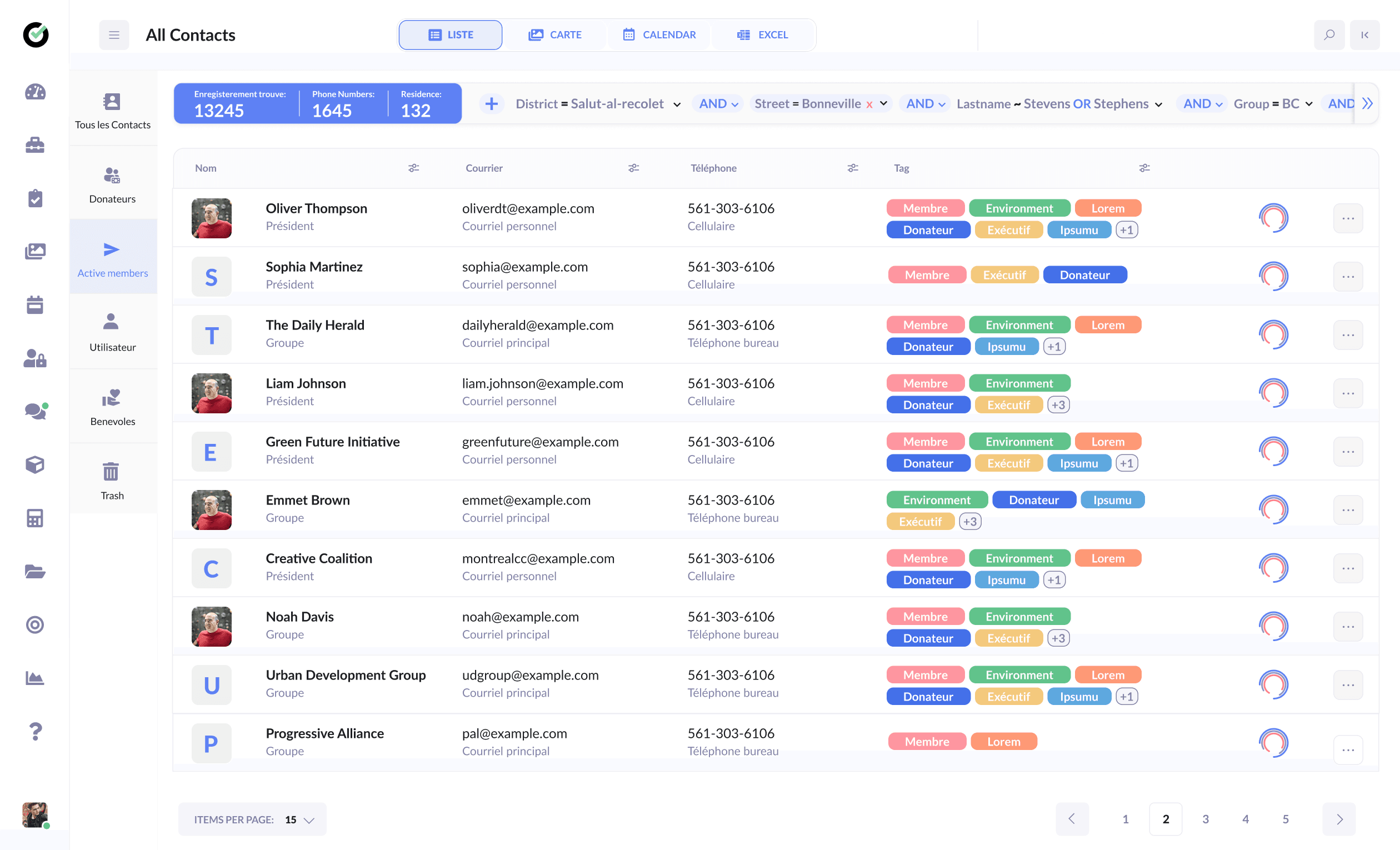
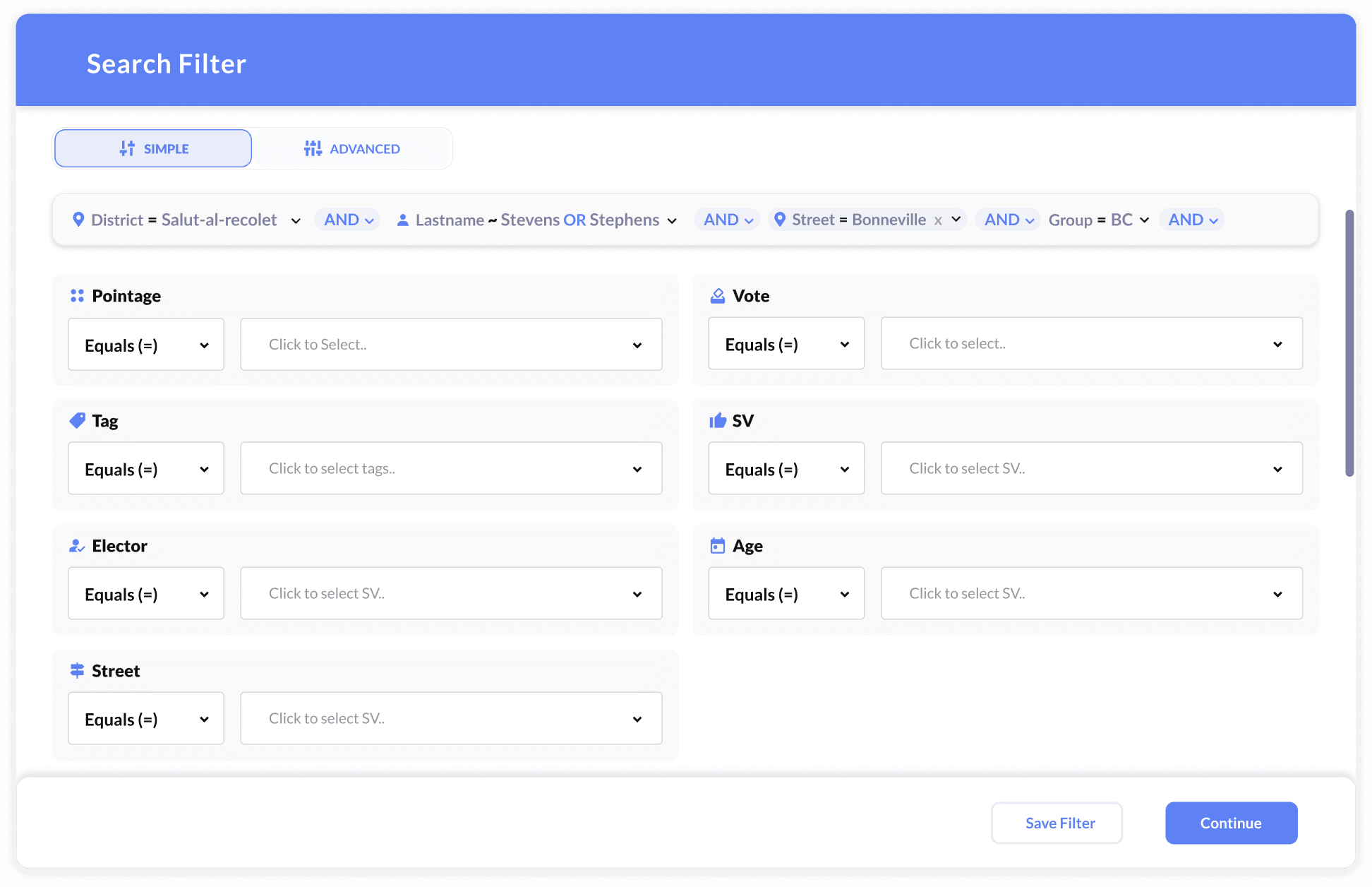
Early on I helped with incremental V2 fixes (spacing, hierarchy, and a few key flows) while the team planned V3. I did not lead a large independent V2 redesign. The V2 screenshots here are reference points for what the product looked like before the rebuild.
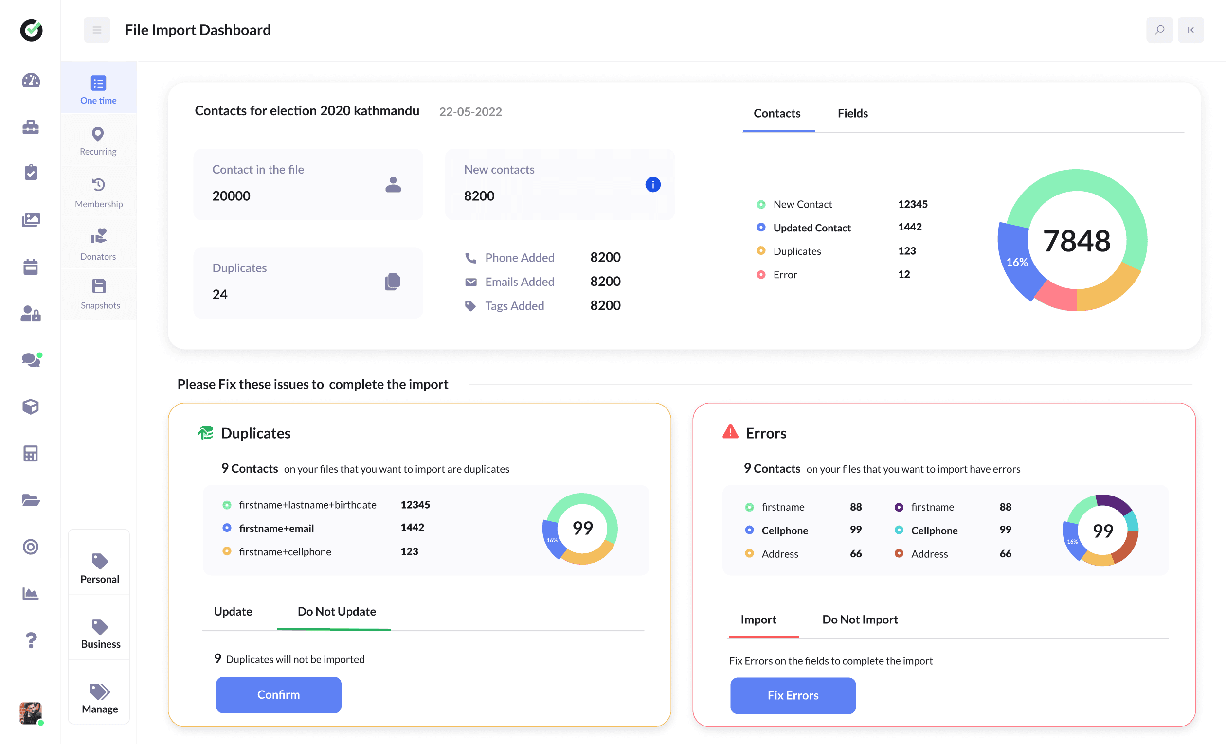
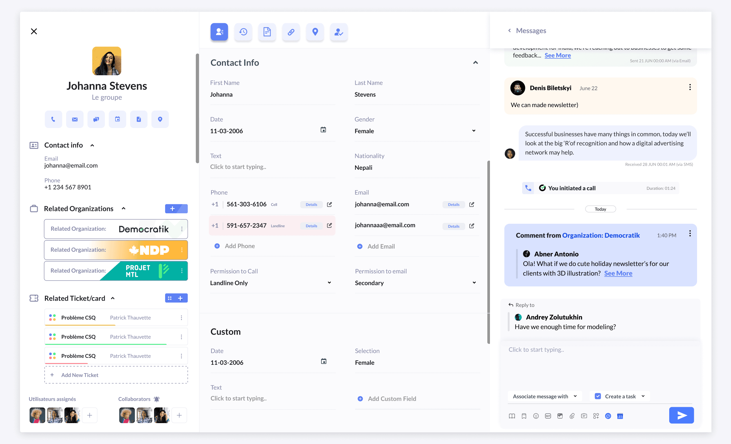
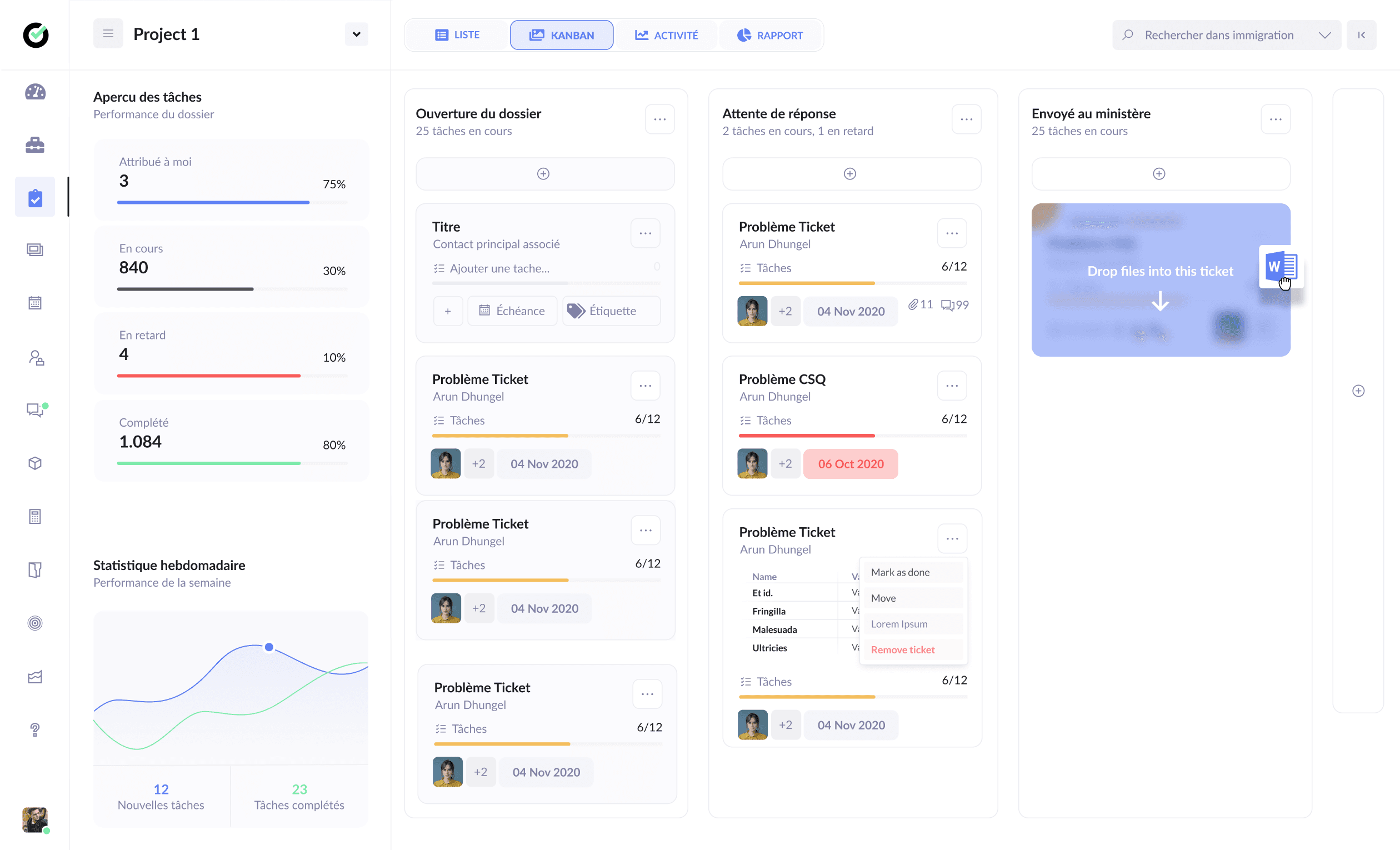
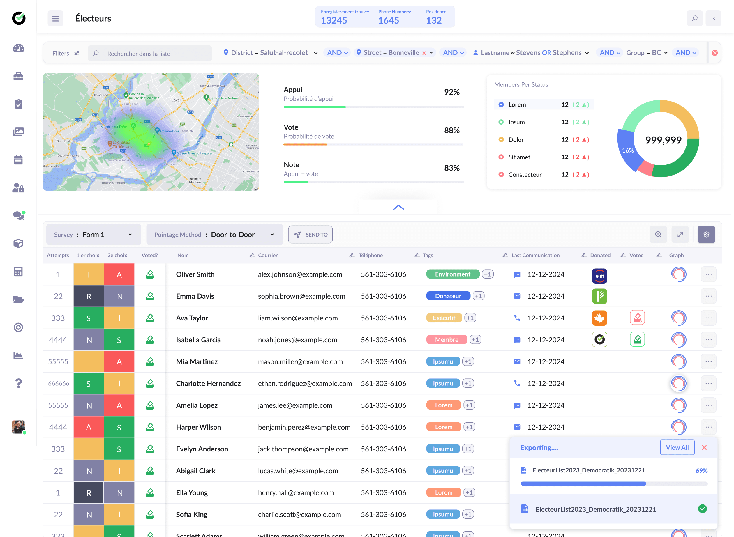
The comparisons below show where V3 changed the experience most: contact browsing, campaign oversight, and supporter profiles moved from utilitarian admin screens to clearer layouts with stronger hierarchy.
Treat these as before/after documentation of the platform shift, not as standalone V2 case studies.
After (V3)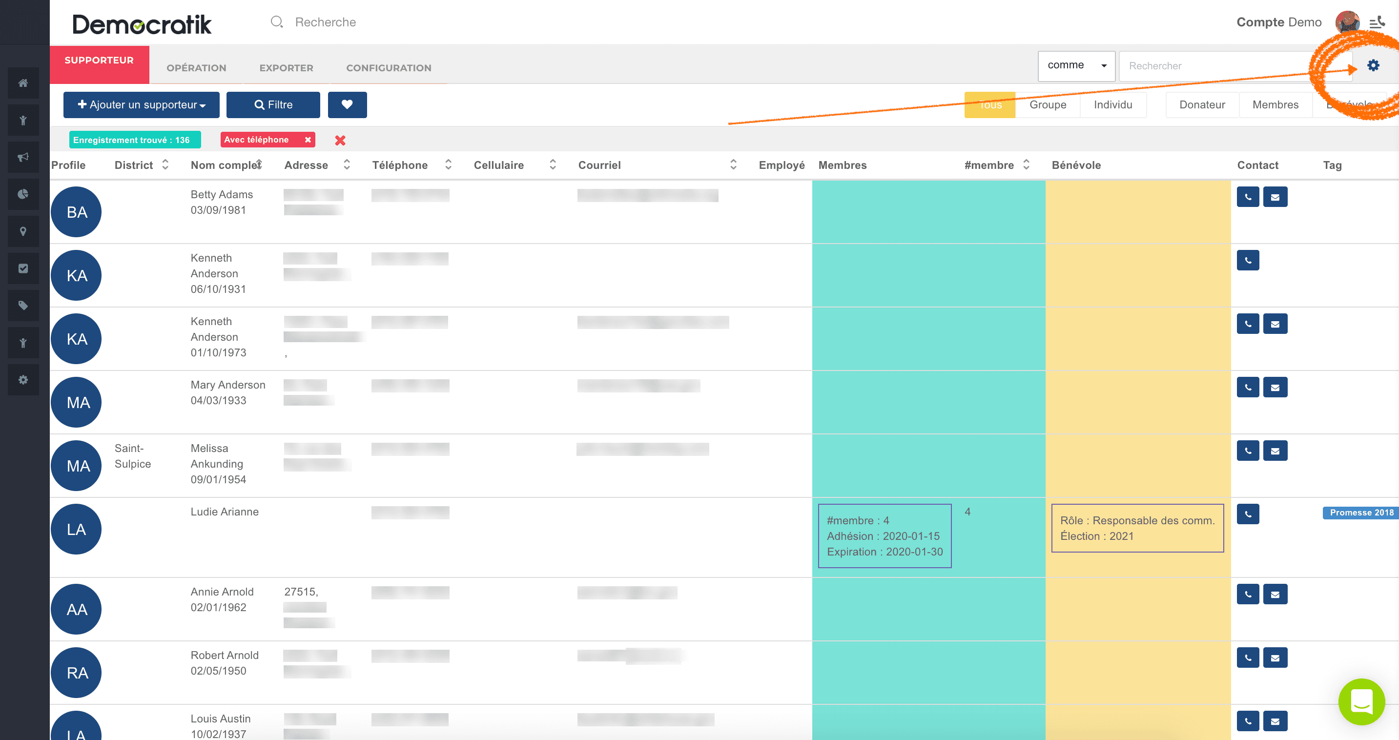
 After (V3)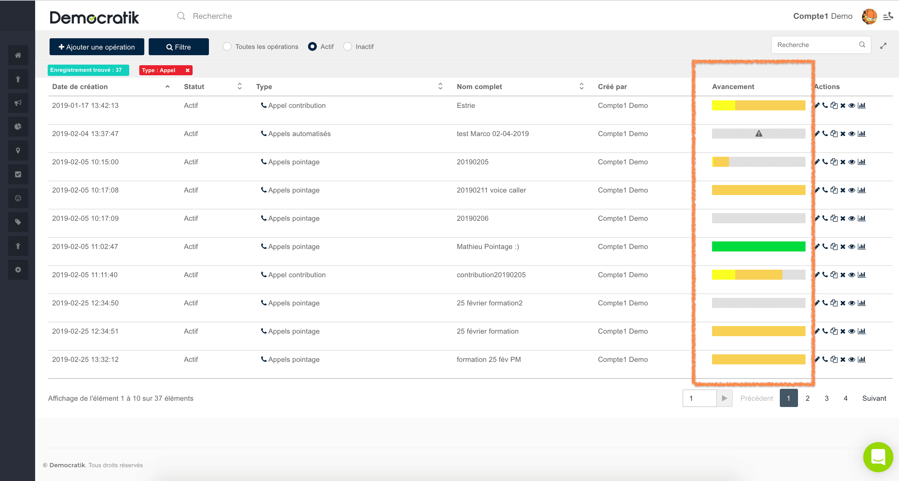
 After (V3)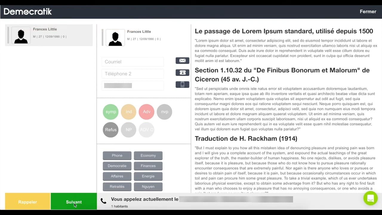
Designing the V3 Vision
A new design language for scale
As V2's limits became clear, we started a redesign: new design language, component structure, and navigation built for the next set of features.
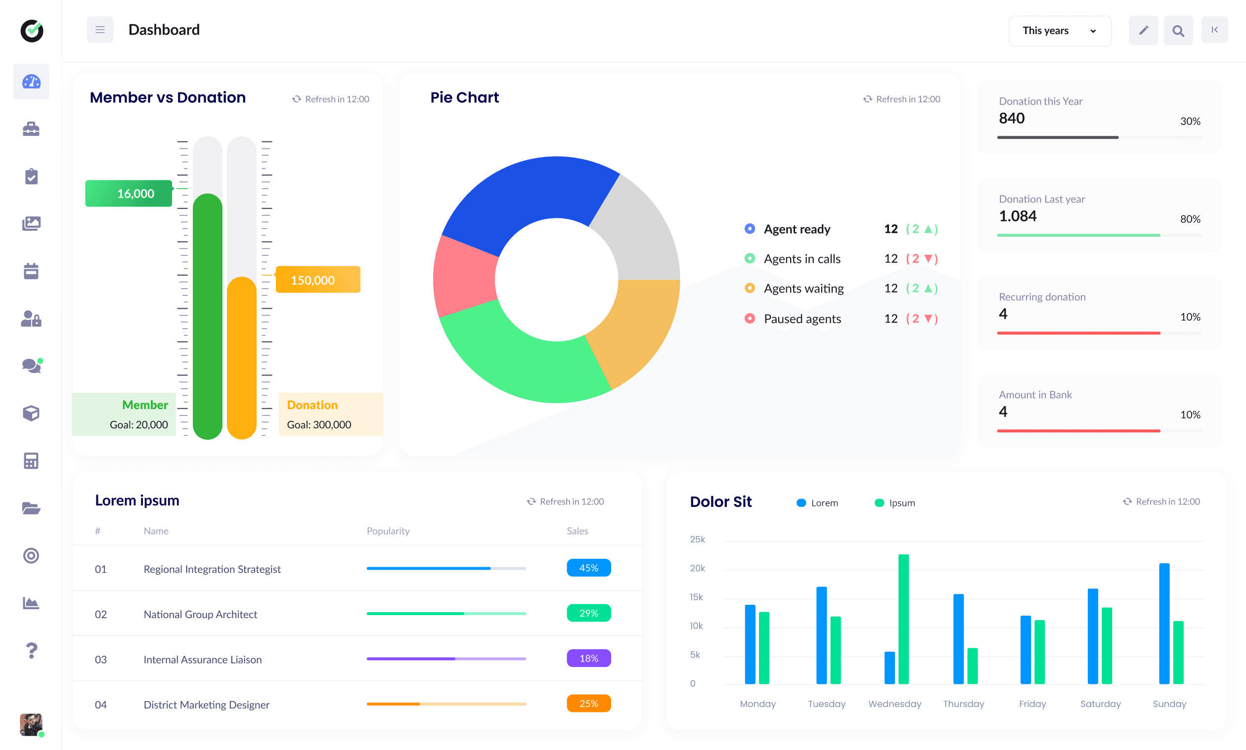
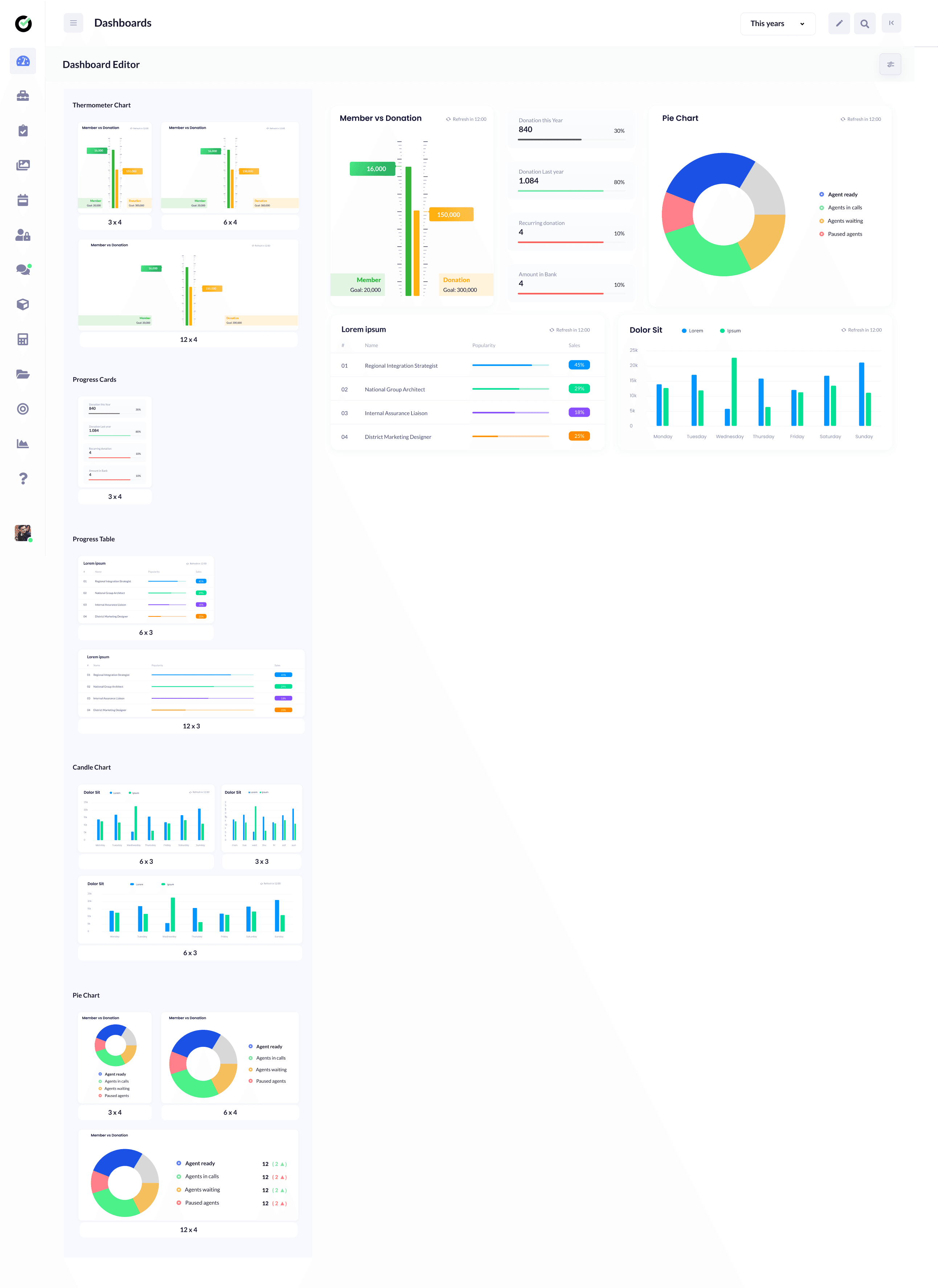
V3 brought customizable dashboards, ticket boards, modular campaign tools, and a more consistent visual system. I worked from wireframes through high-fidelity design with engineering on what was feasible.
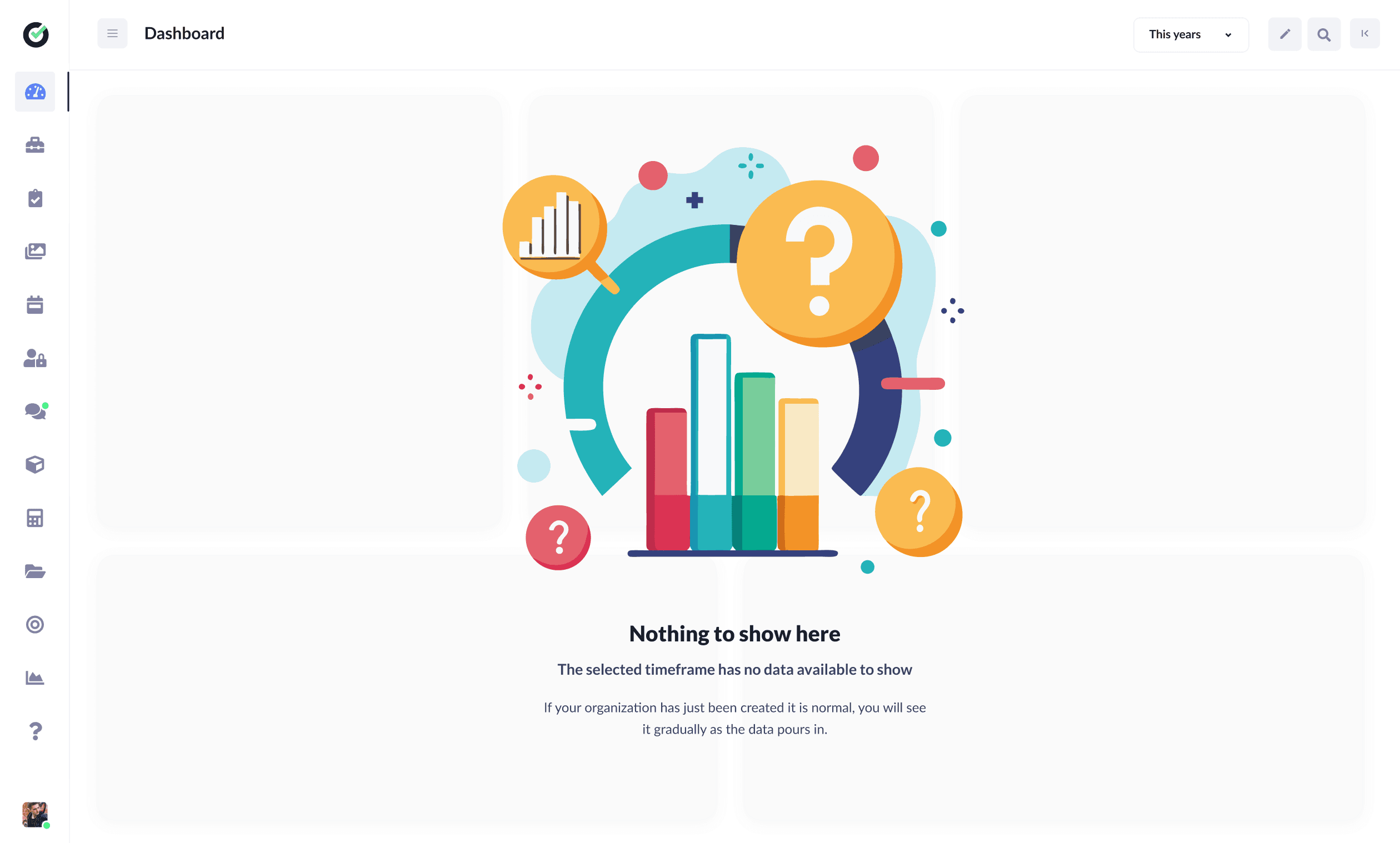
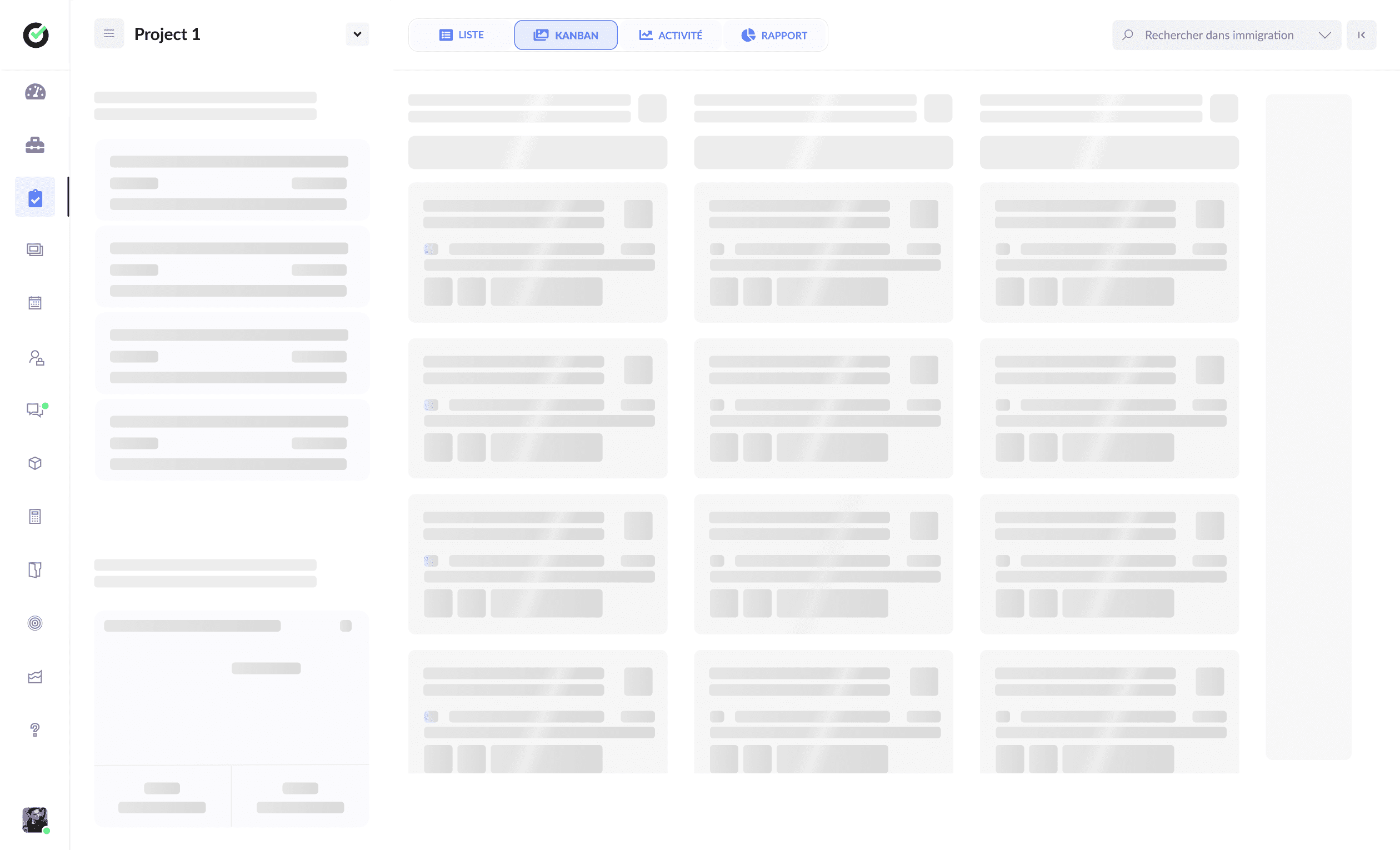
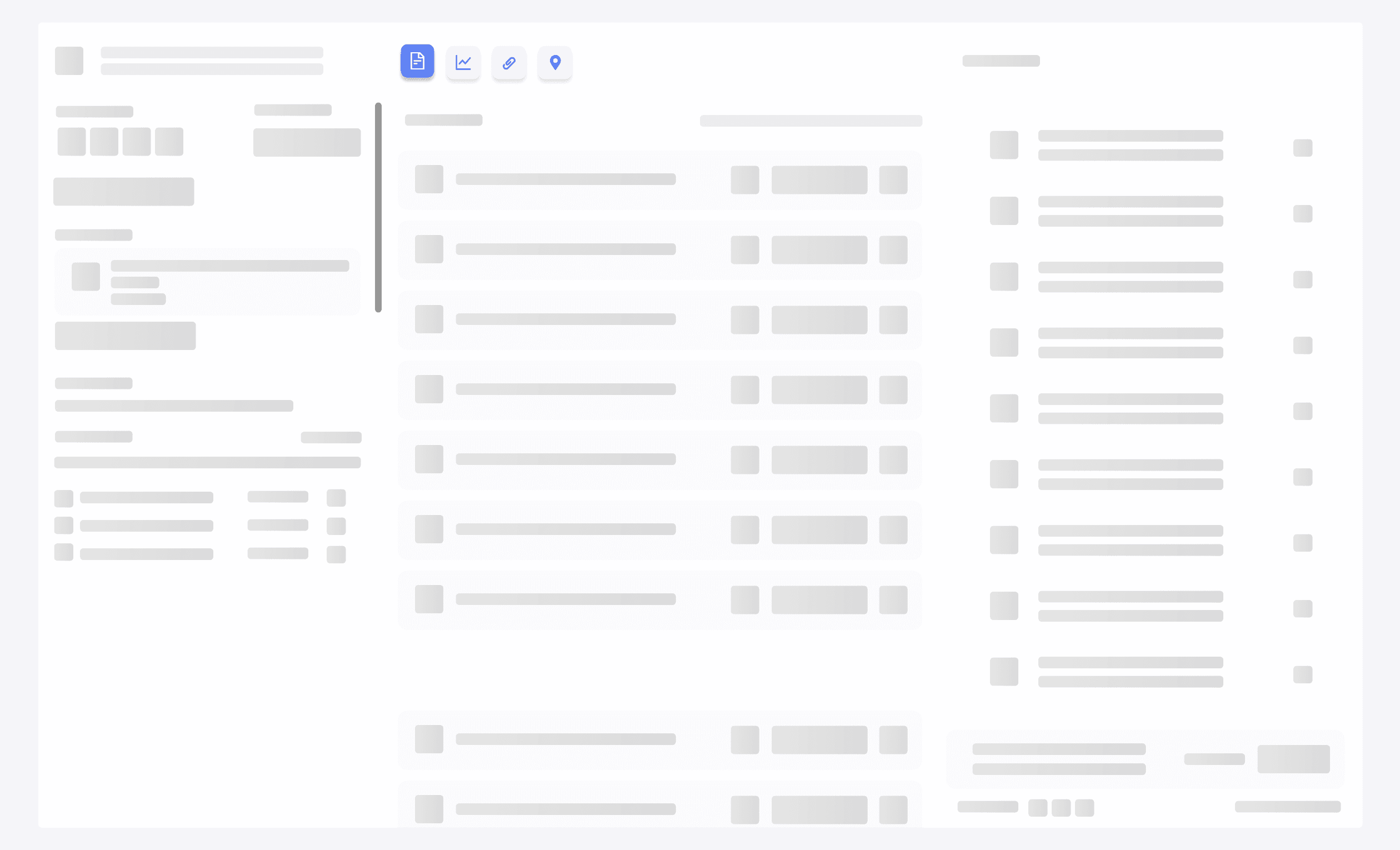
Core ideas: configurable home screens by role, clear empty states when a timeframe or new org has no data yet, skeleton loading for data-heavy views, and modals that keep people in context instead of sending them to a new page.
Information Architecture & Permissions
Complex orgs, clear structure
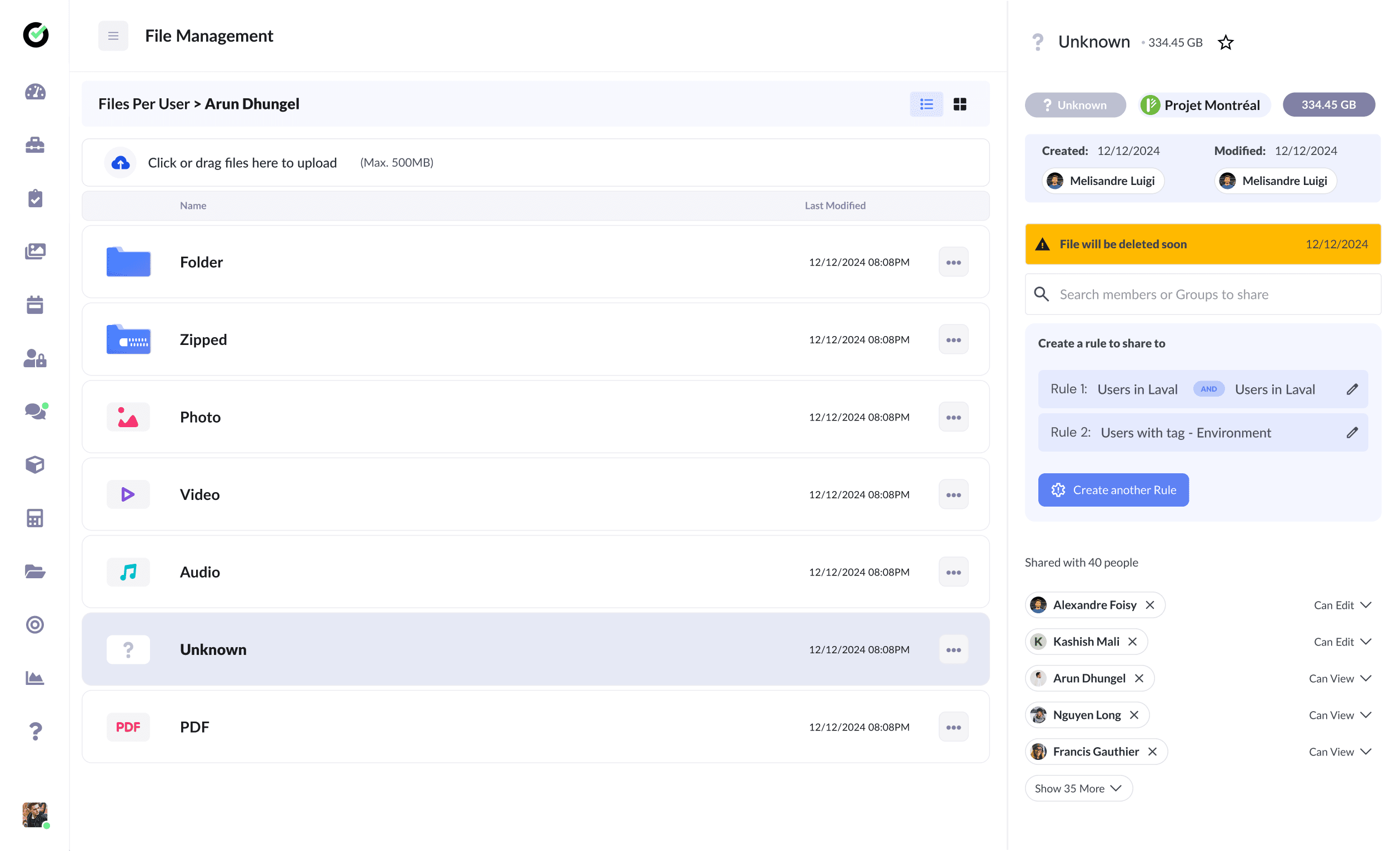
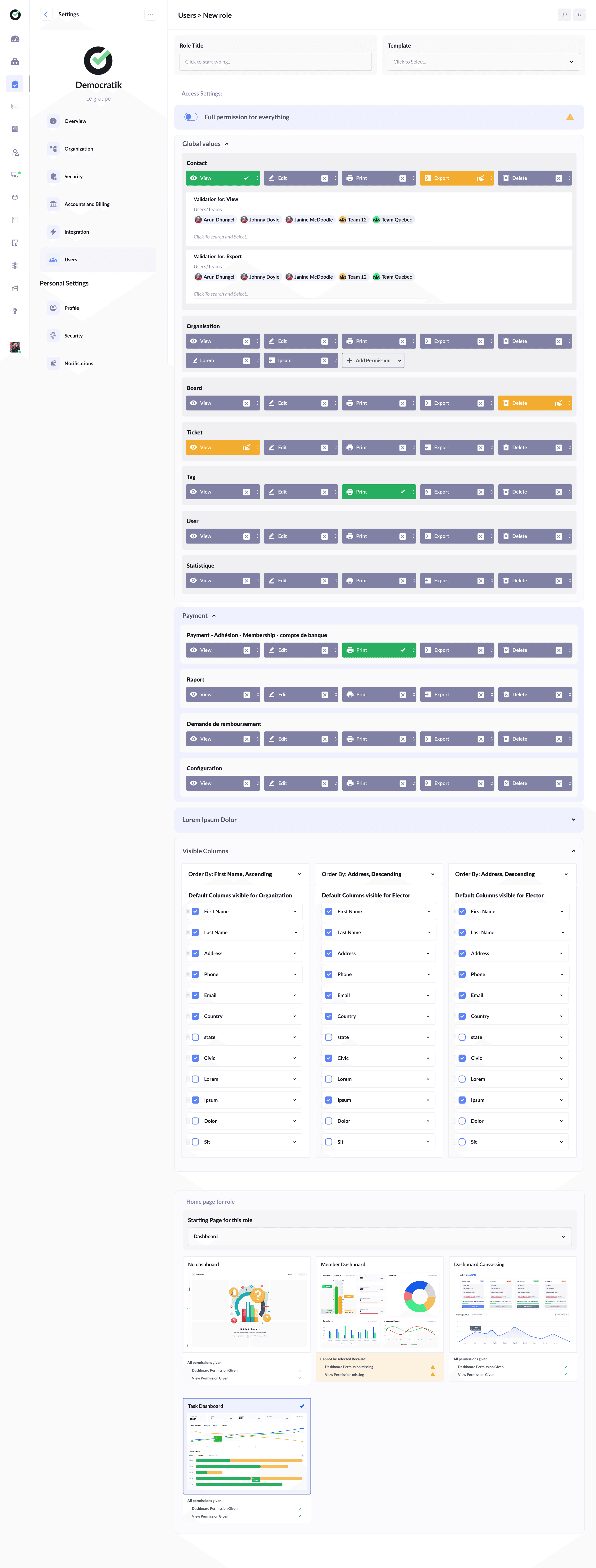
Democratik serves groups from small local chapters to national parties with many sub-chapters. The IA had to support nested permissions, delegated admins, and people who belong to more than one org.
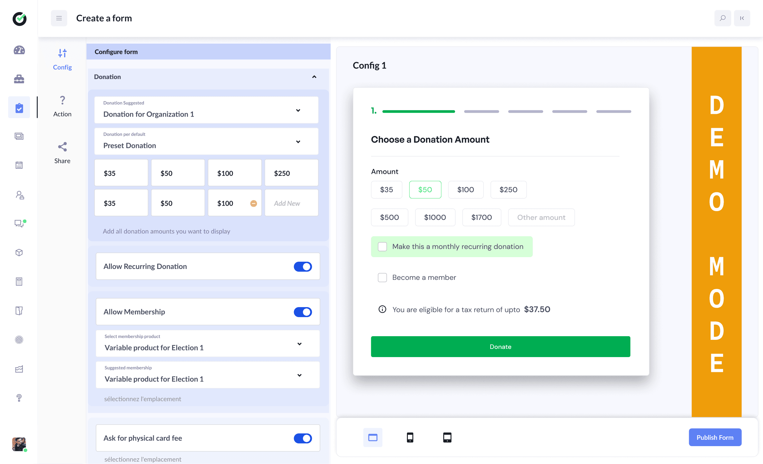
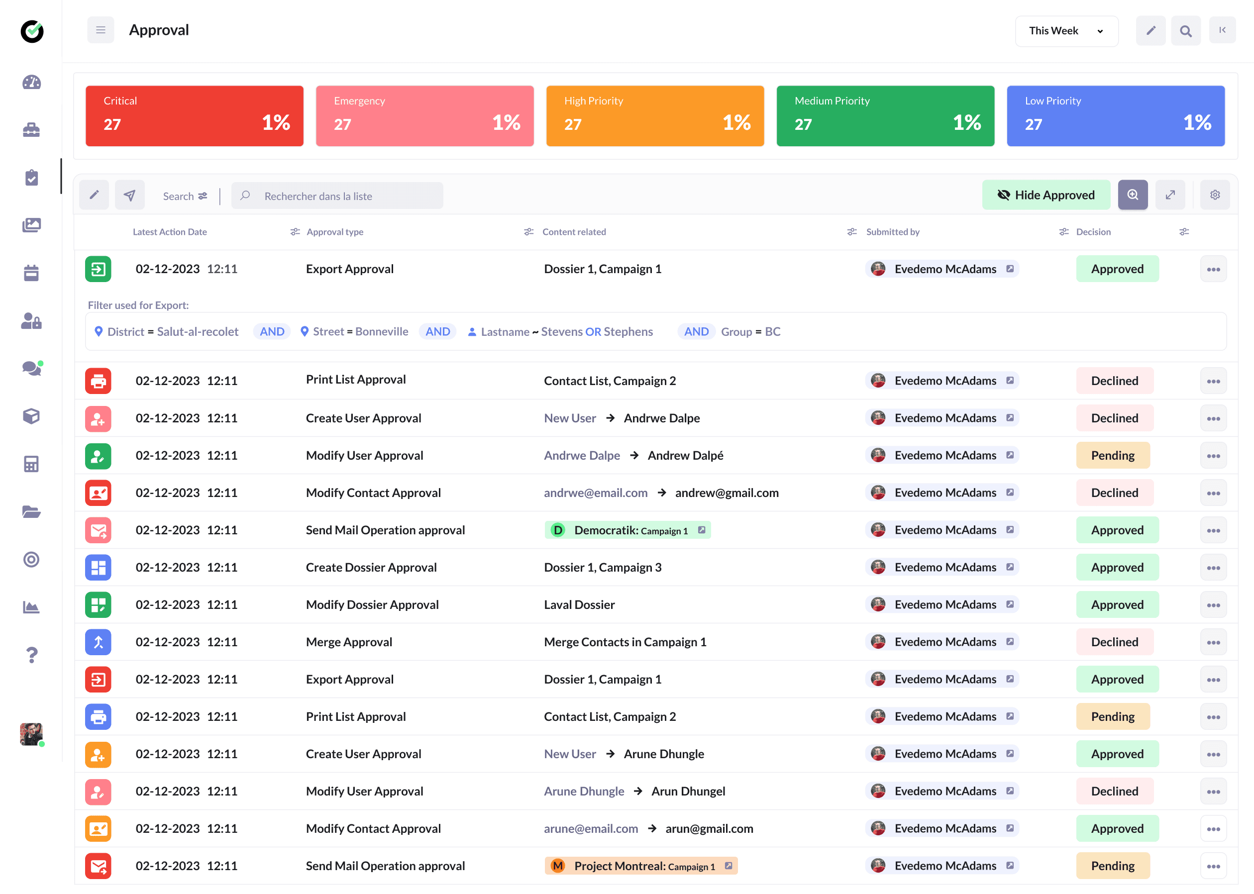
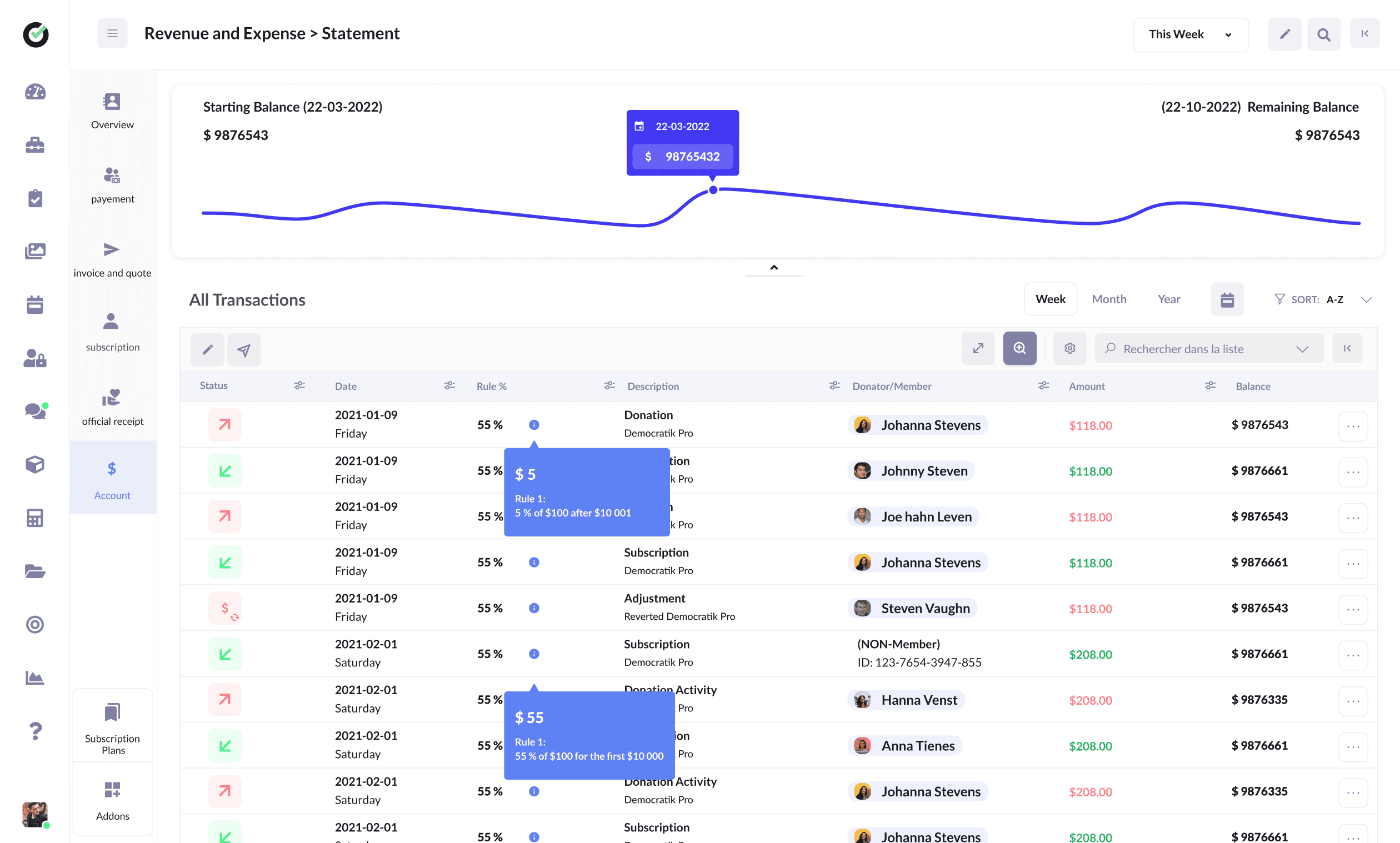
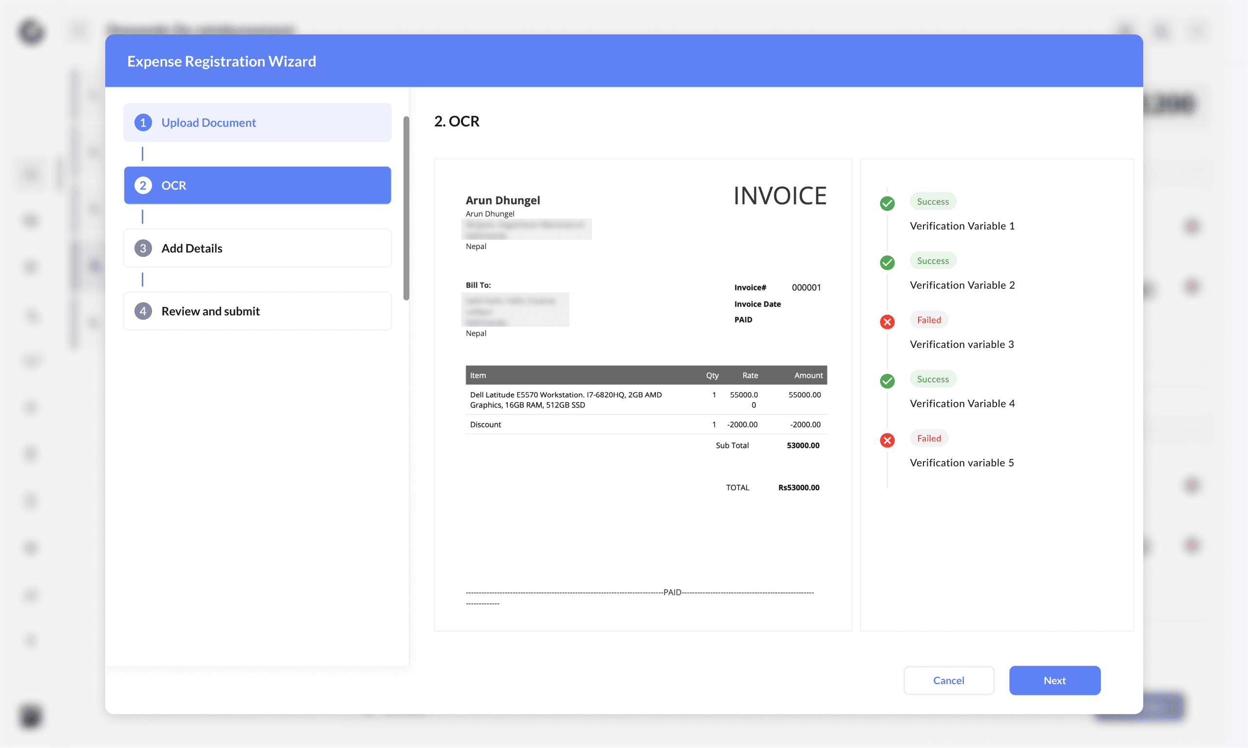
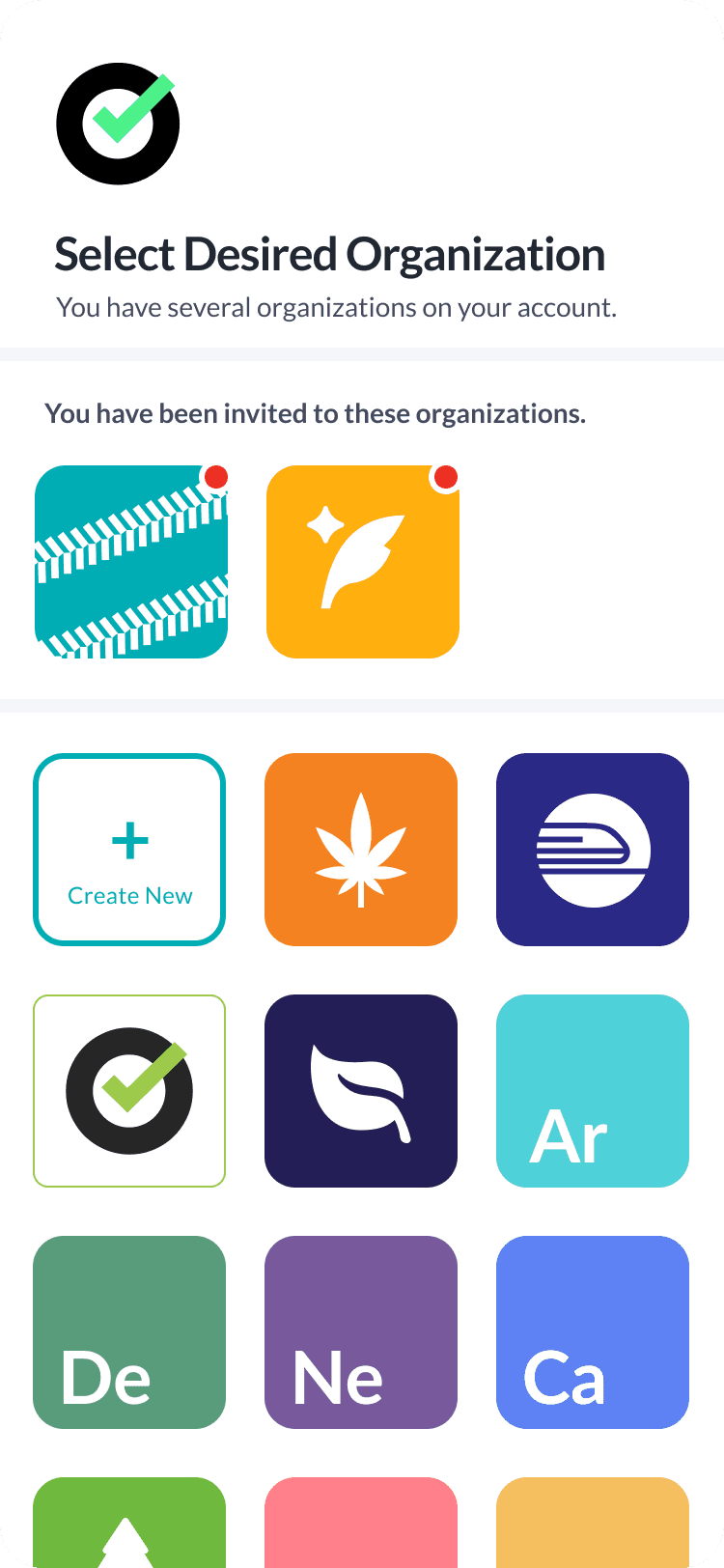
I designed role and permission management, approval queues for sensitive actions, organization switching, and income/expense flows for chapter finances, including OCR-assisted expense registration.
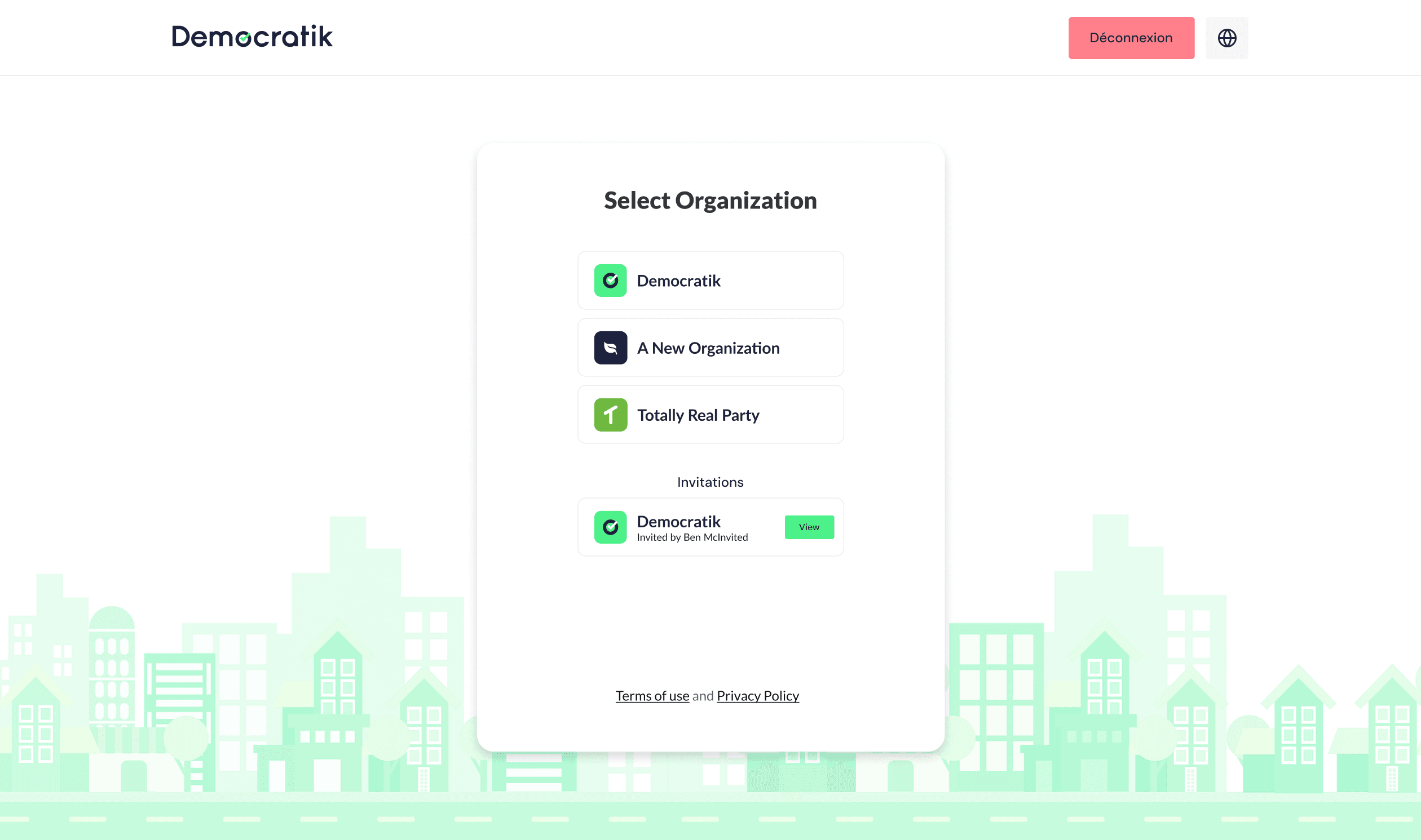
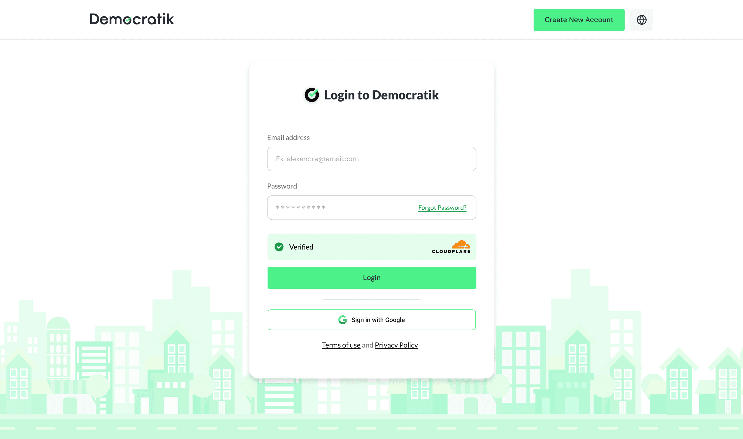
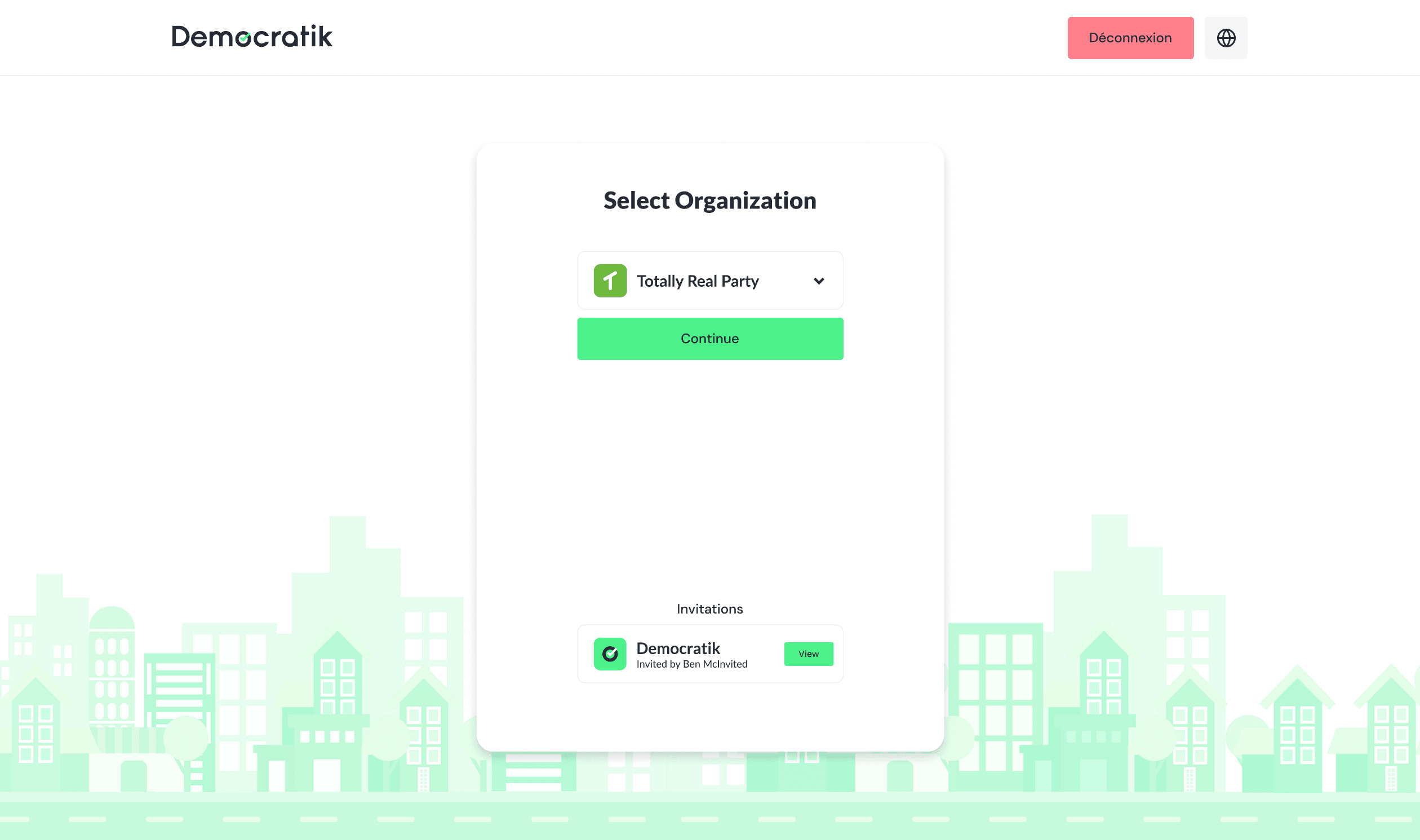
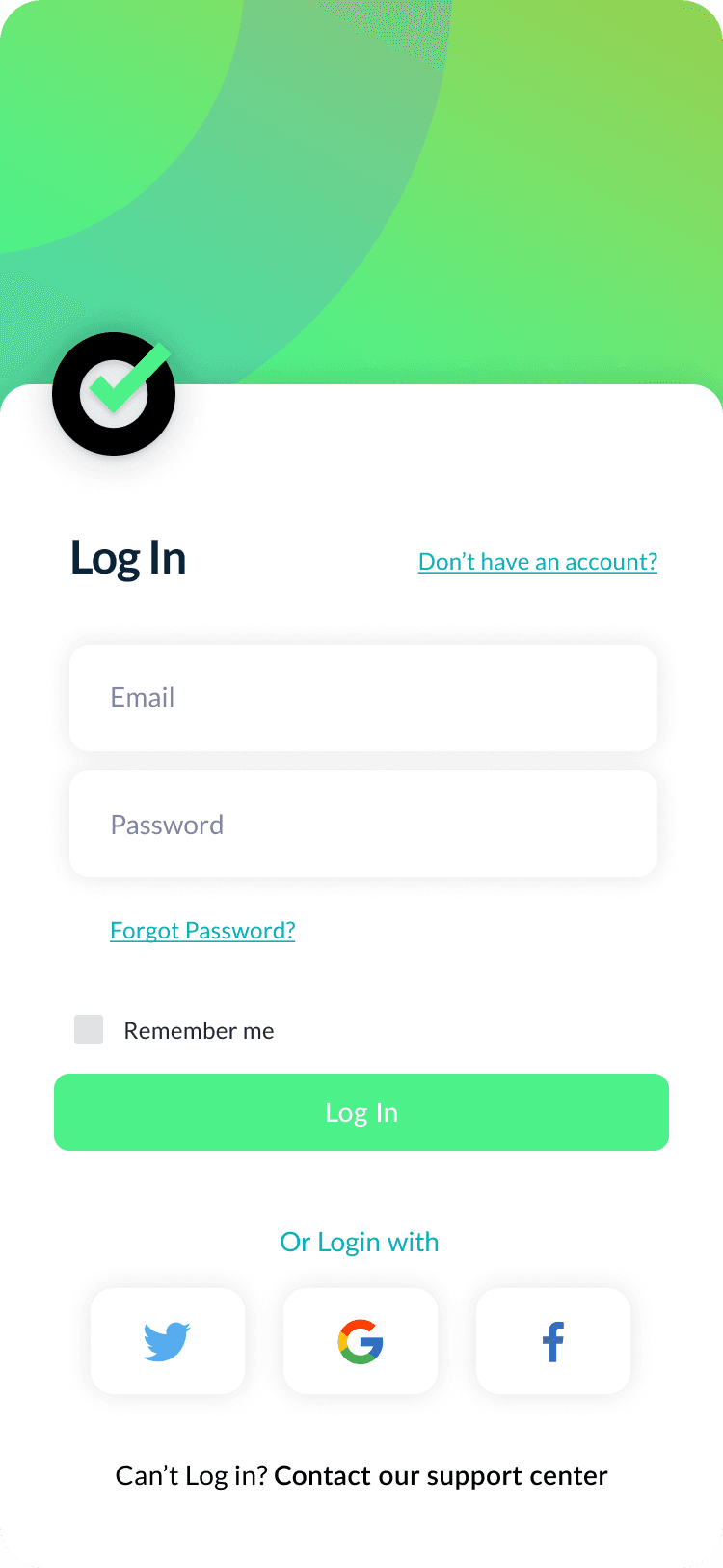
Login and org selection mattered a lot. Multi-org users need to land in the right context quickly.
Campaign & Outreach Workflows
From script to send to survey
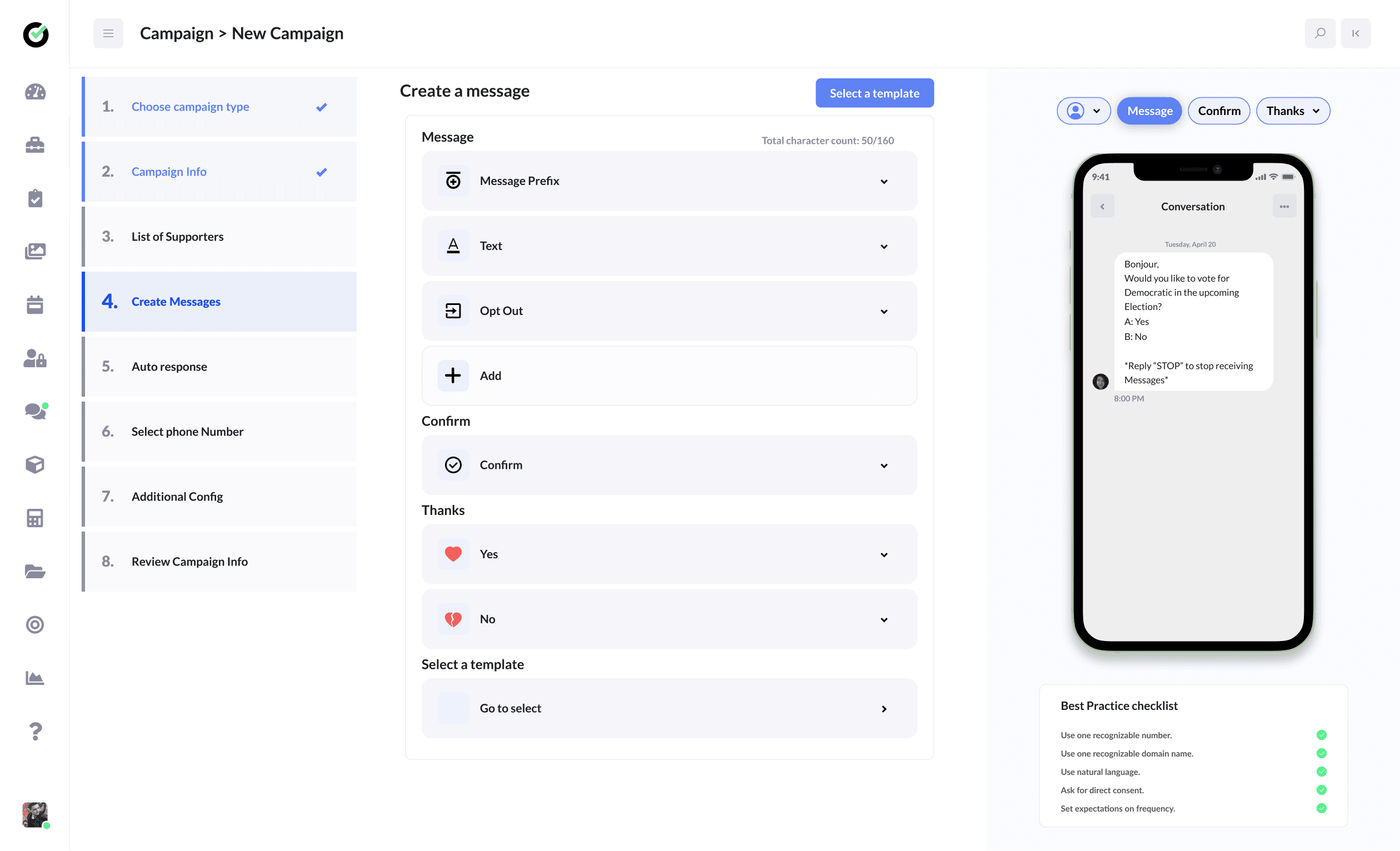
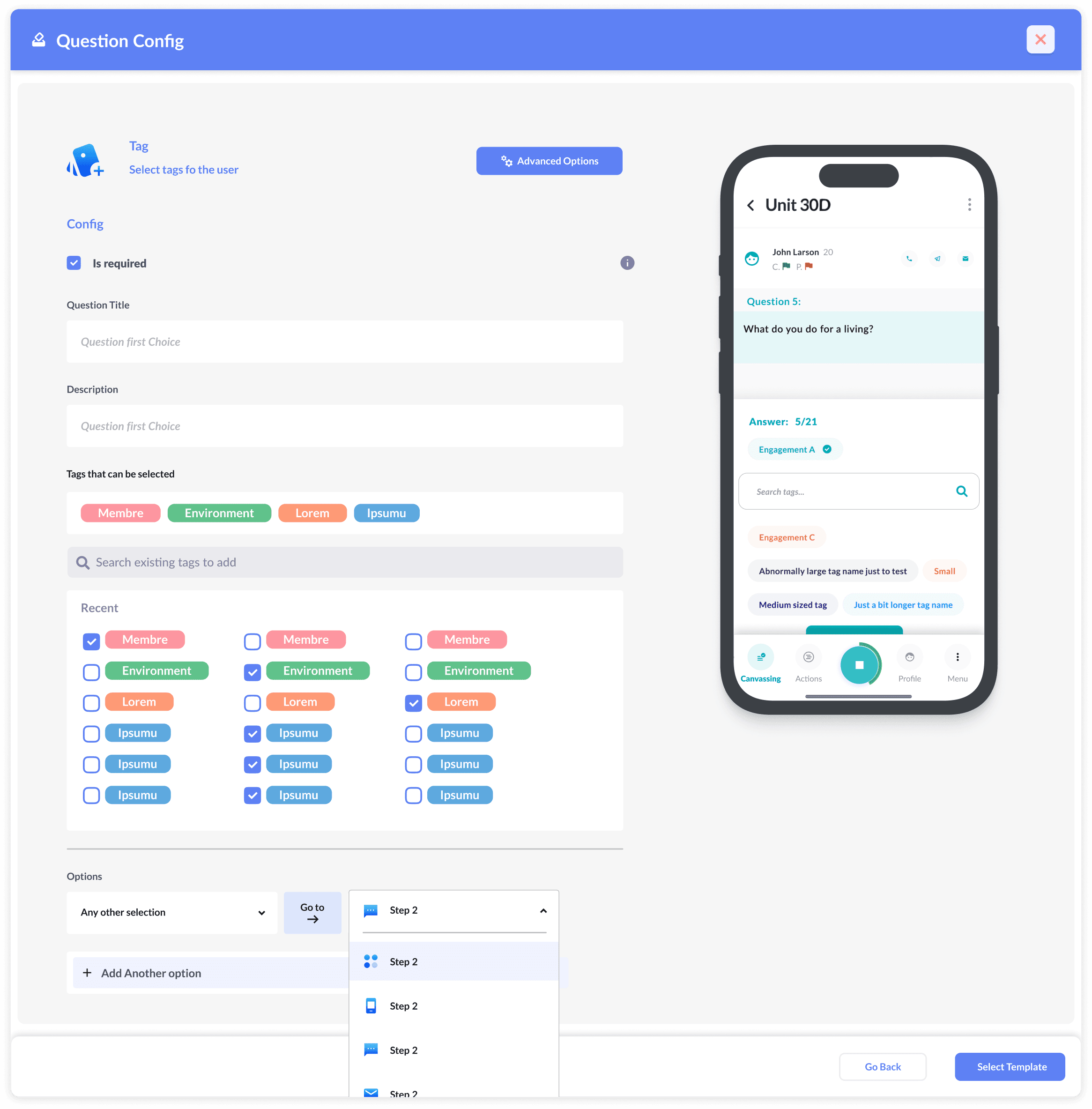
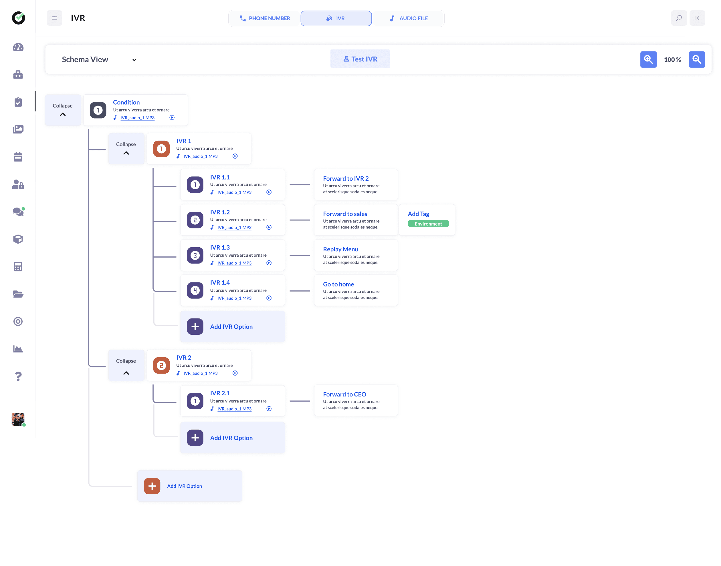
Campaign tools are the core of Democratik: SMS, phone banking with scripts, IVR, canvassing routes, and feedback forms. Each channel has different constraints, but results need to land on the same contact record.
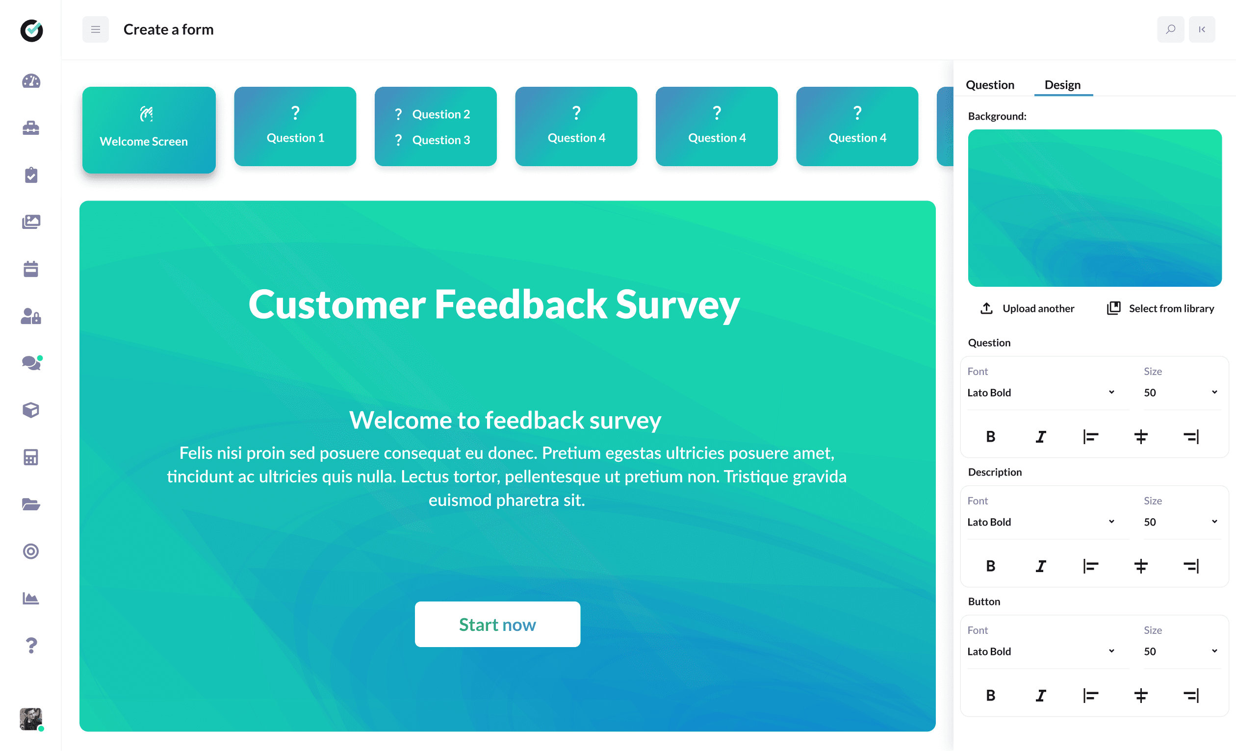
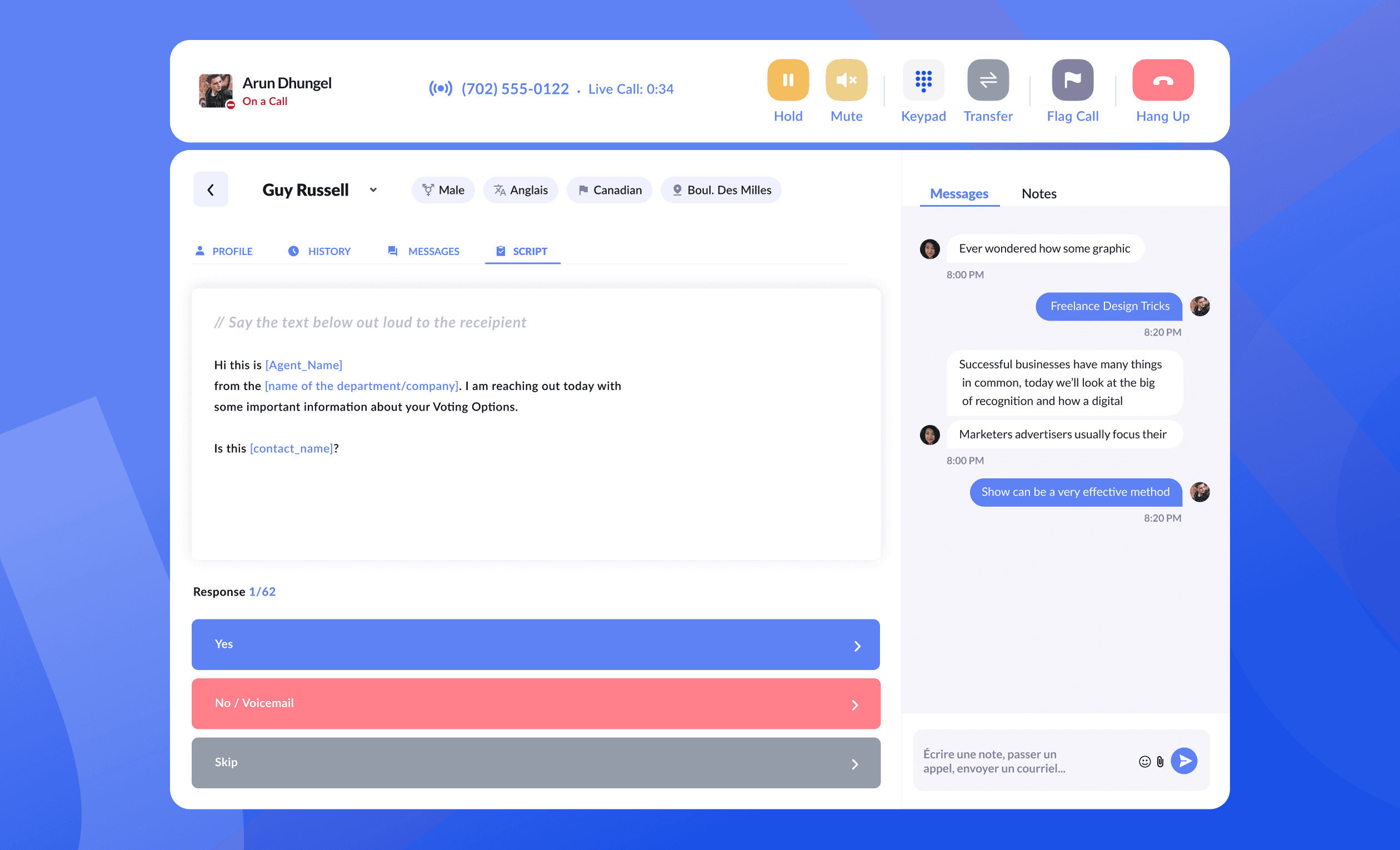
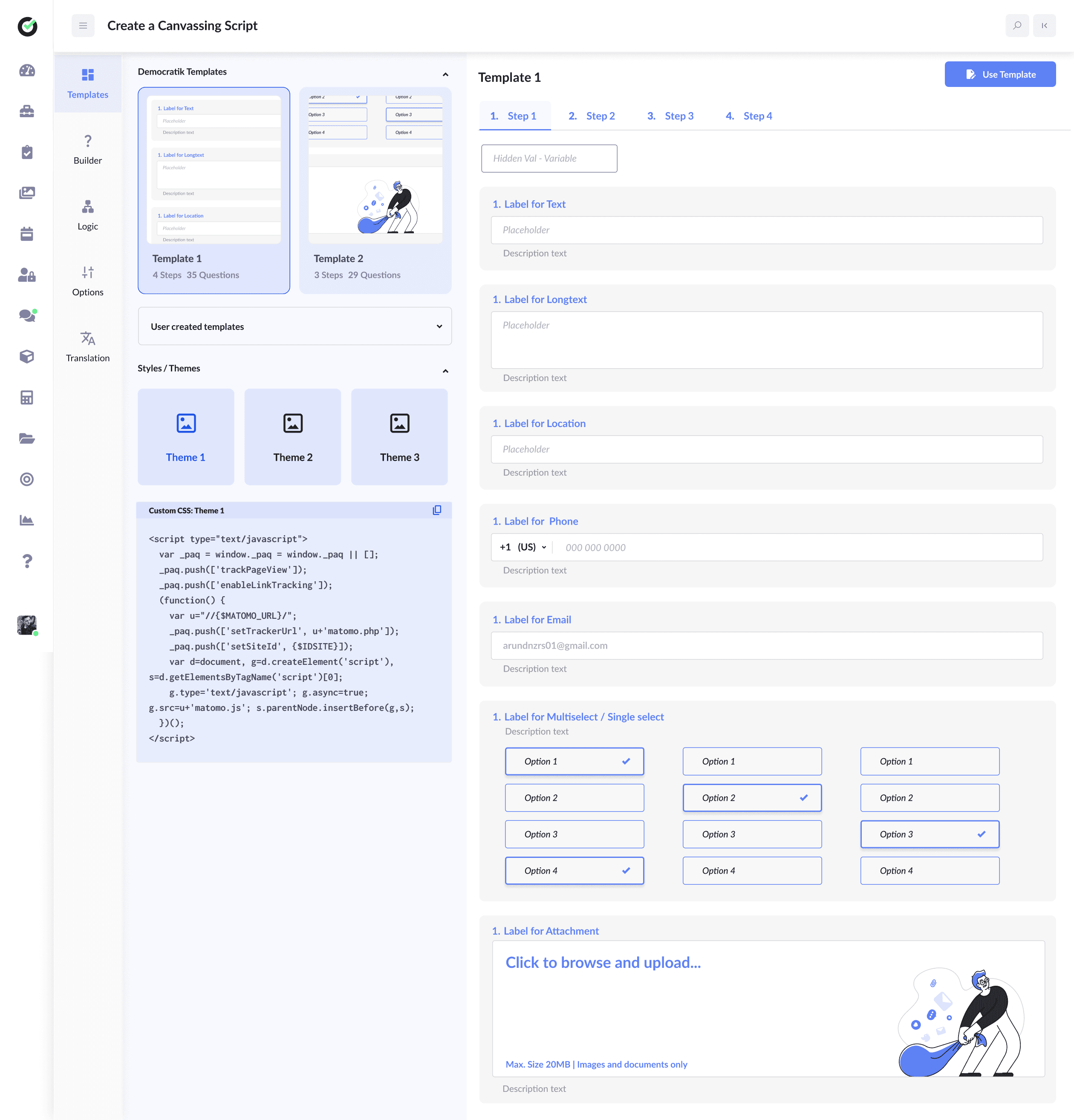
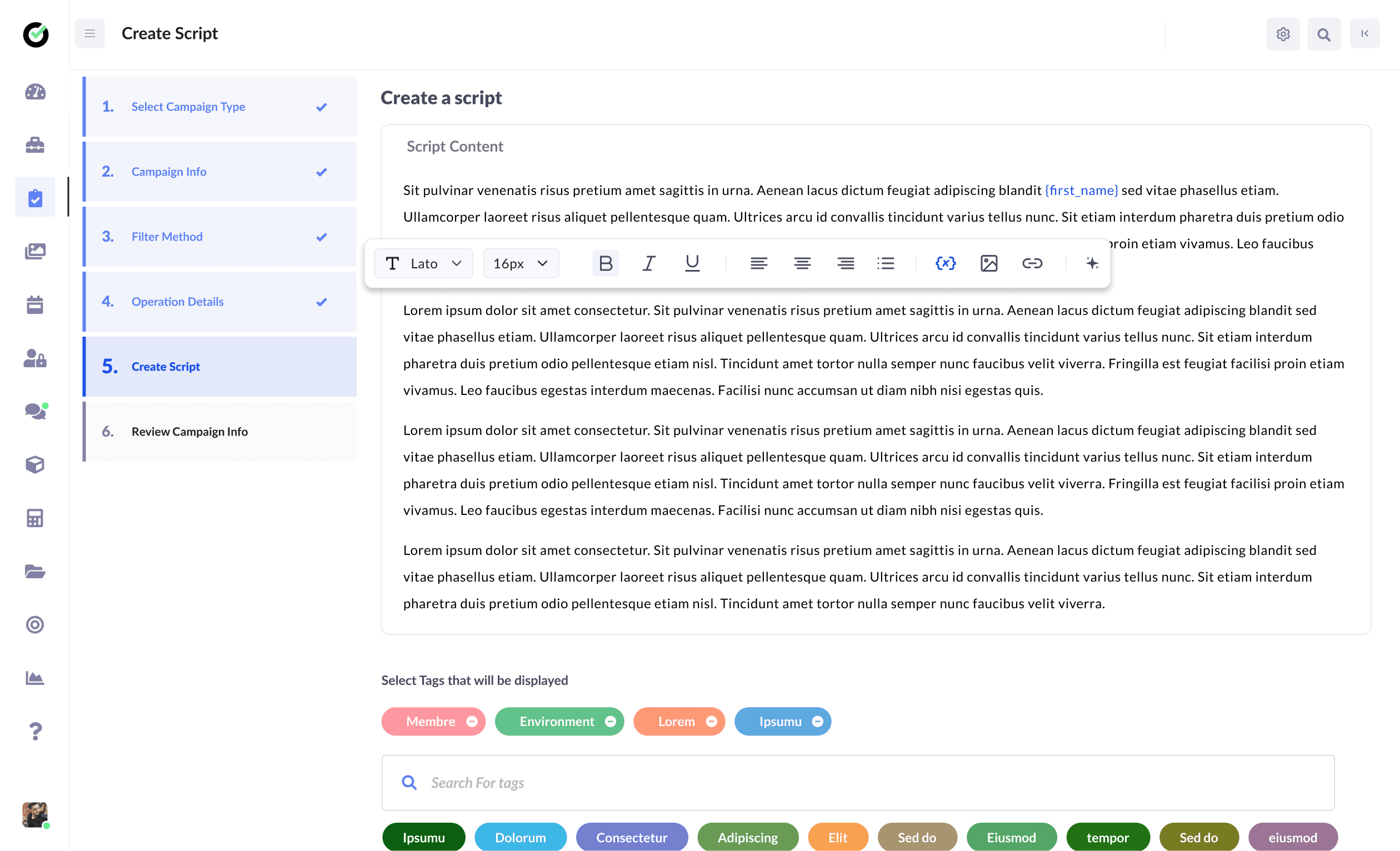
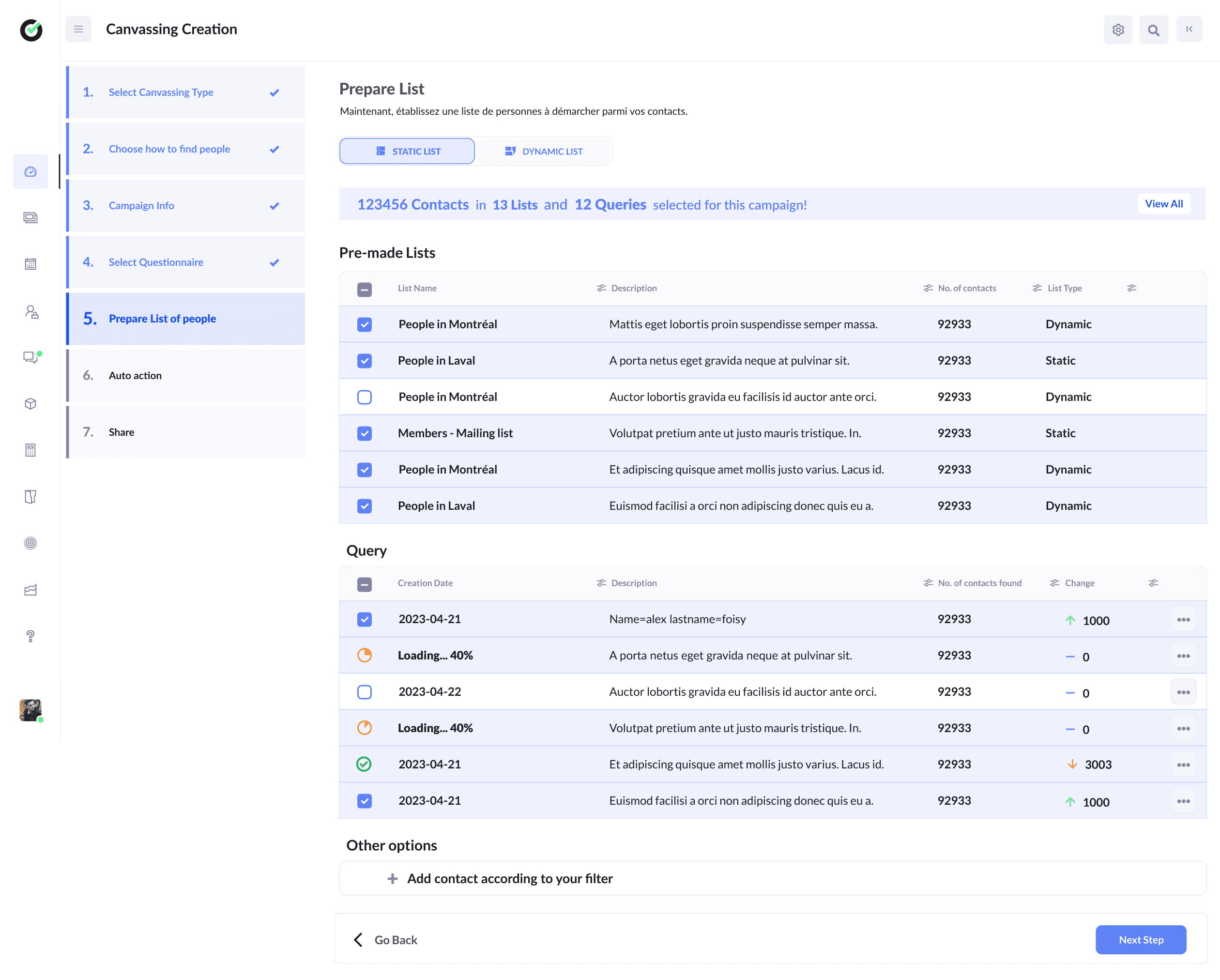
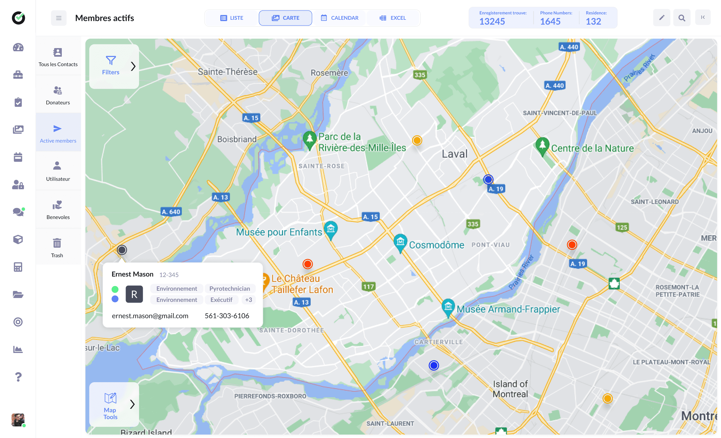
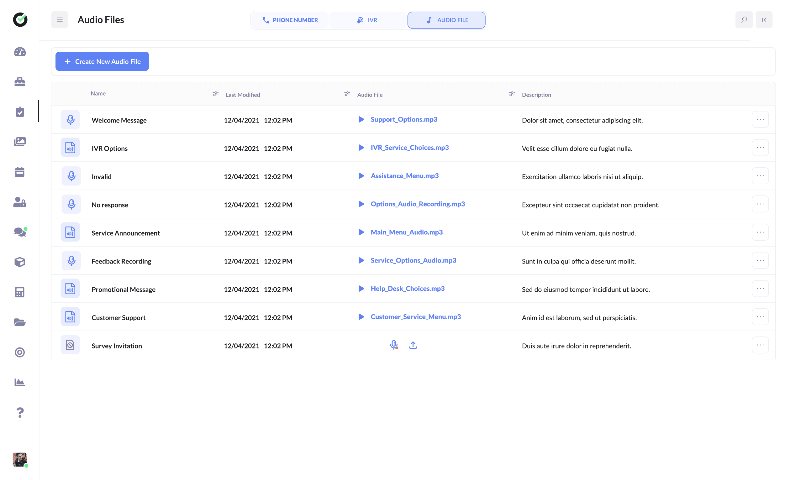
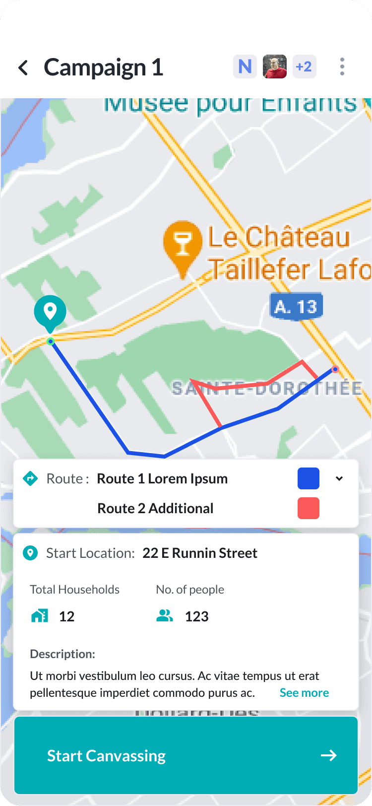
I designed setup wizards for admins, interactive and text-only script builders, canvassing list prep with static and dynamic lists, map views for geographic routes, and audio libraries that feed IVR prompts.
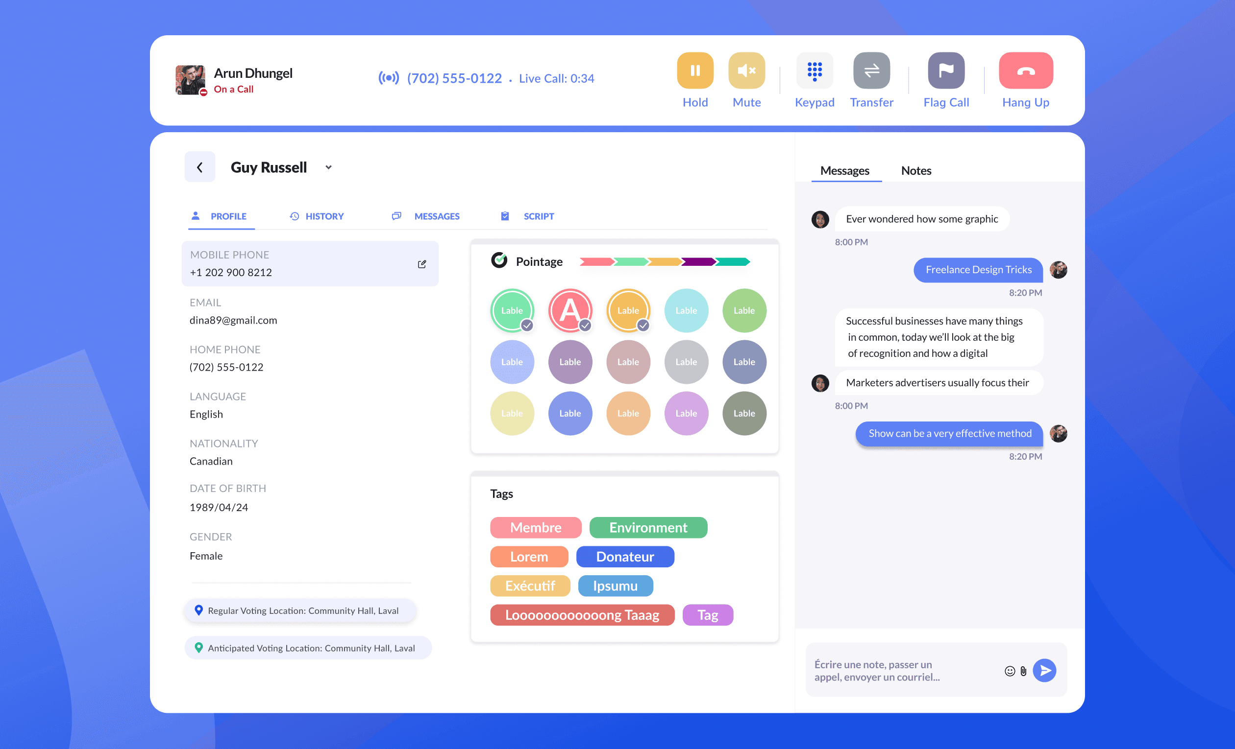
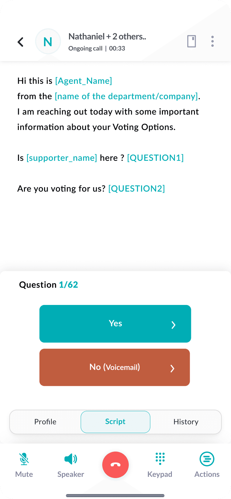
The call center keeps the script and the supporter profile side by side so agents have context during the conversation.
 After (V3)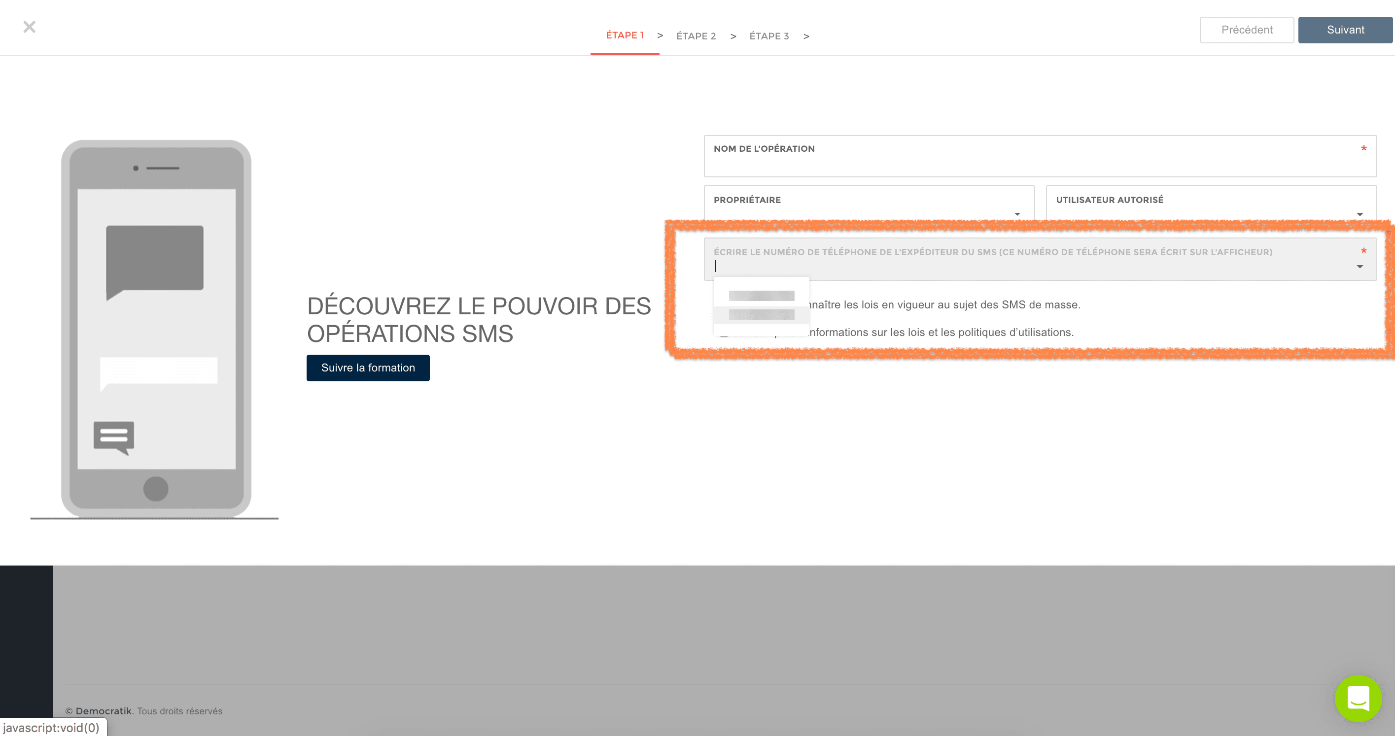
Mobile Field Operations
Design for volunteers at the door
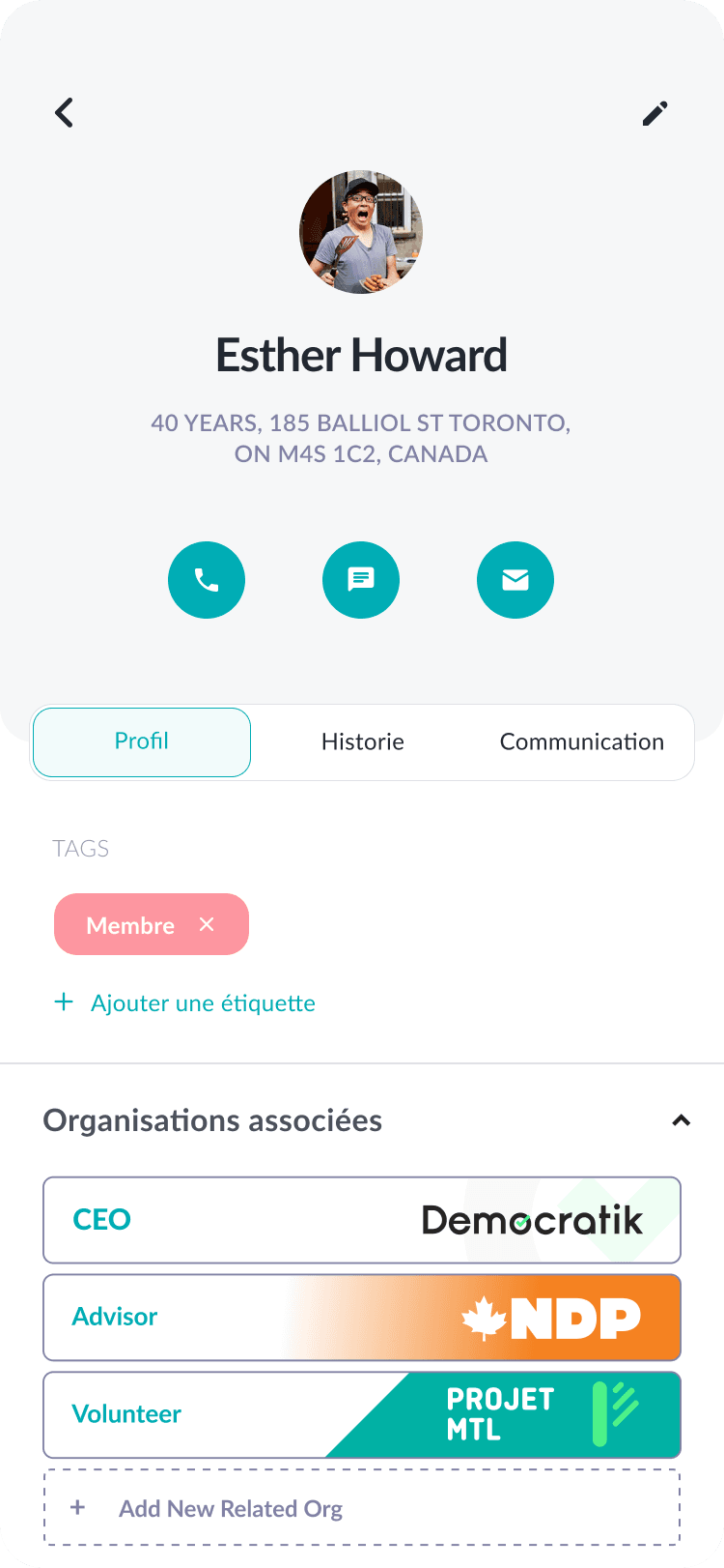
The mobile app is where Democratik earns its 4.8/5 rating. Volunteers use it for door-to-door canvassing, phone banking, tickets, and quick supporter lookups, often outdoors with poor connectivity and little time at each door.
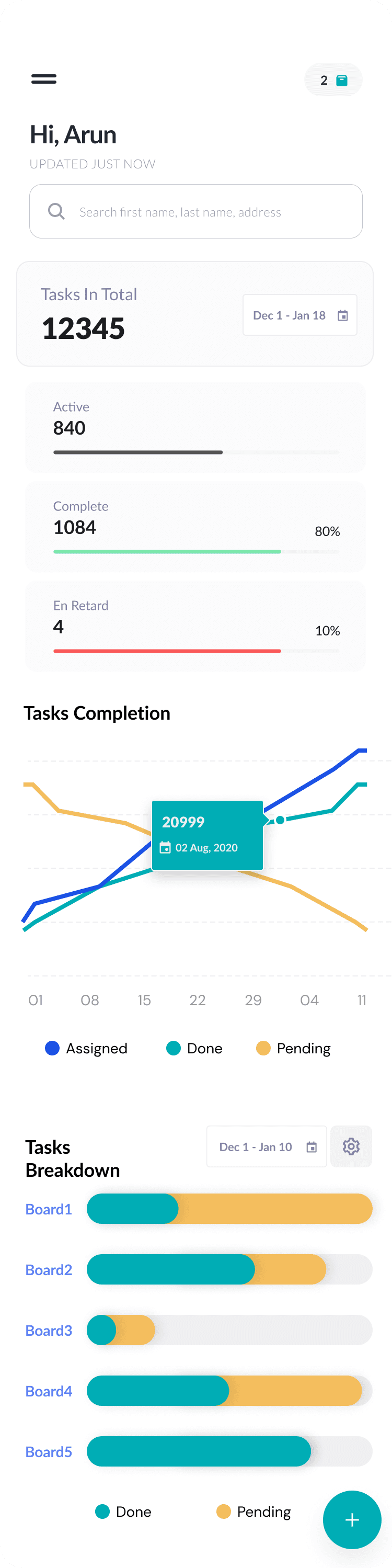
I designed mobile flows with large touch targets, skeleton loading for lists, and task dashboards for what needs doing today. Login and org selection mirror desktop multi-org complexity without crowding a small screen.
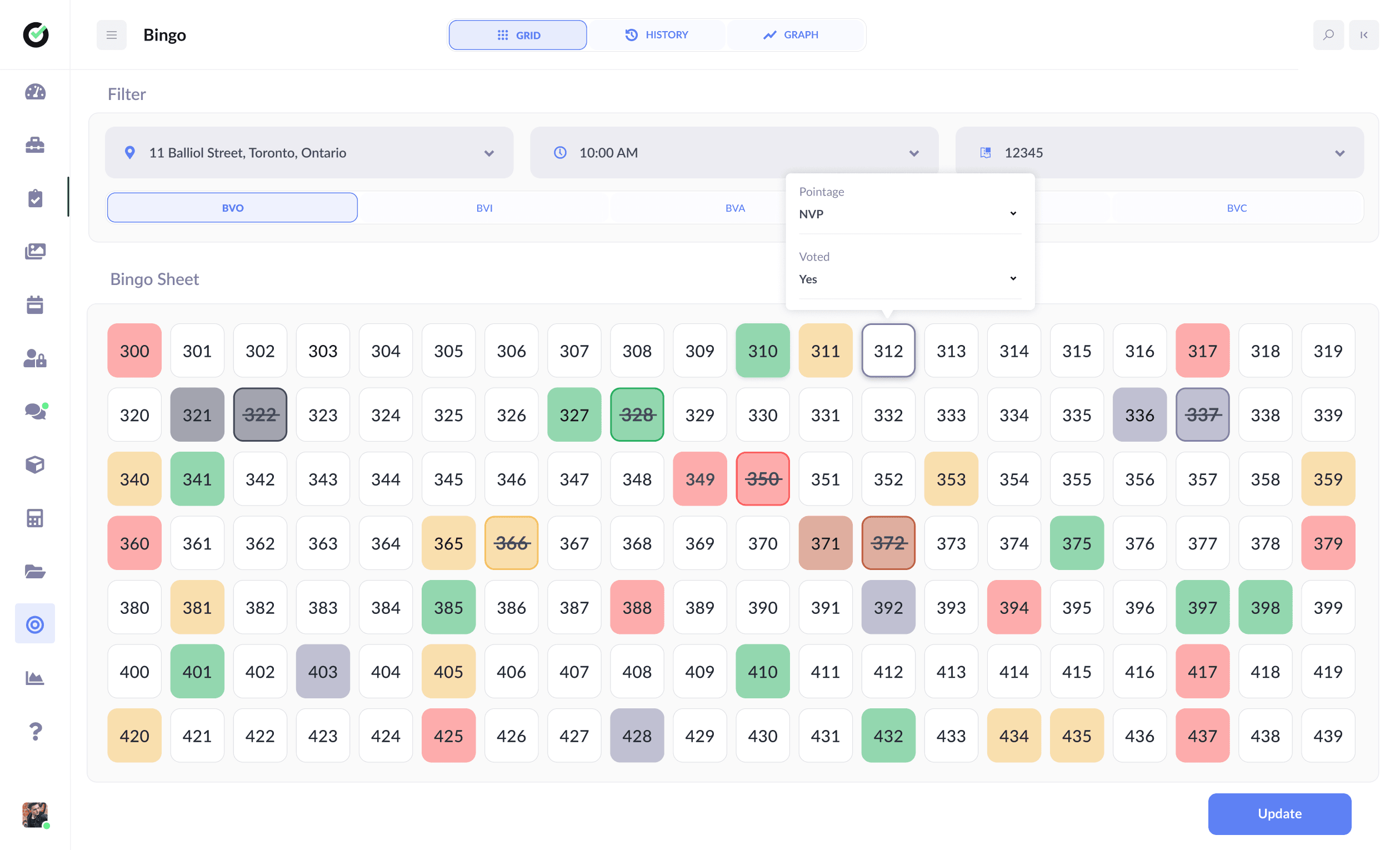
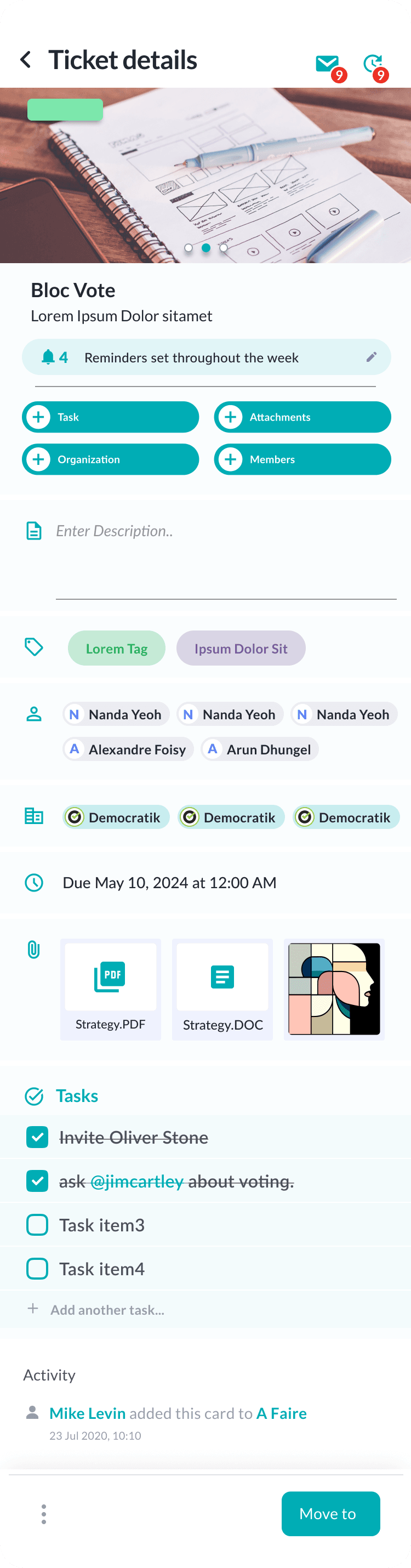
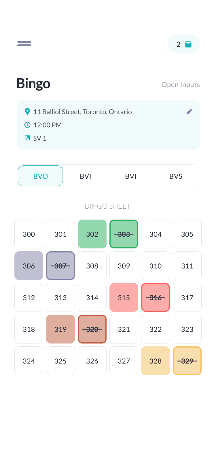
Ticket views, bingo-style volunteer engagement, and in-call scripts were refined with field teams.
Outcomes & Platform Impact
Published results from Democratik
The platform now serves over 7,000 active users across more than 1,500 political parties and organizations. The mobile app holds a 4.8 out of 5 rating on app stores, which matches the field-first choices we made.
Beyond the numbers, the redesign cut navigation-related support issues, sped up campaign setup through wizards, and made it easier to onboard new volunteers.
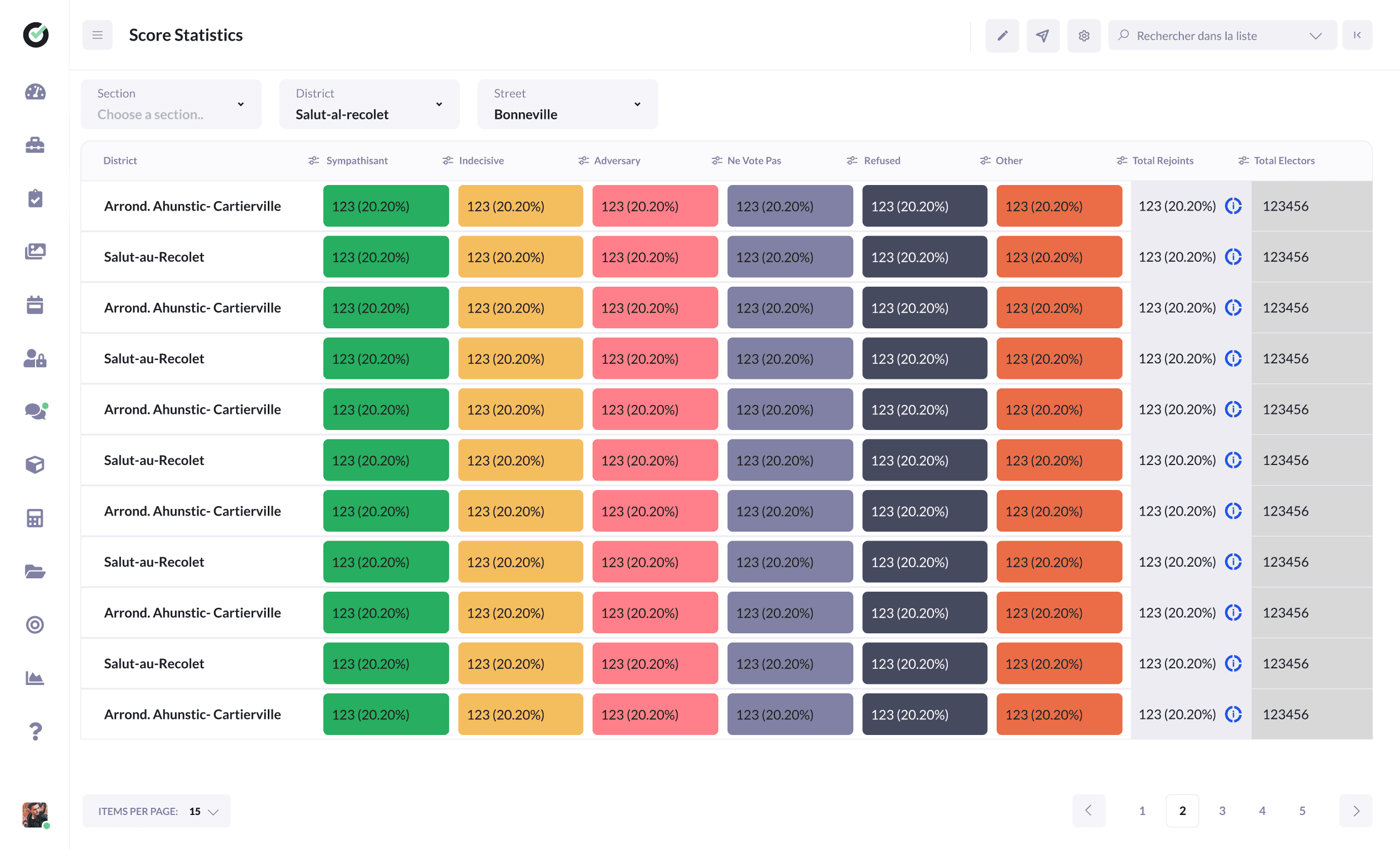
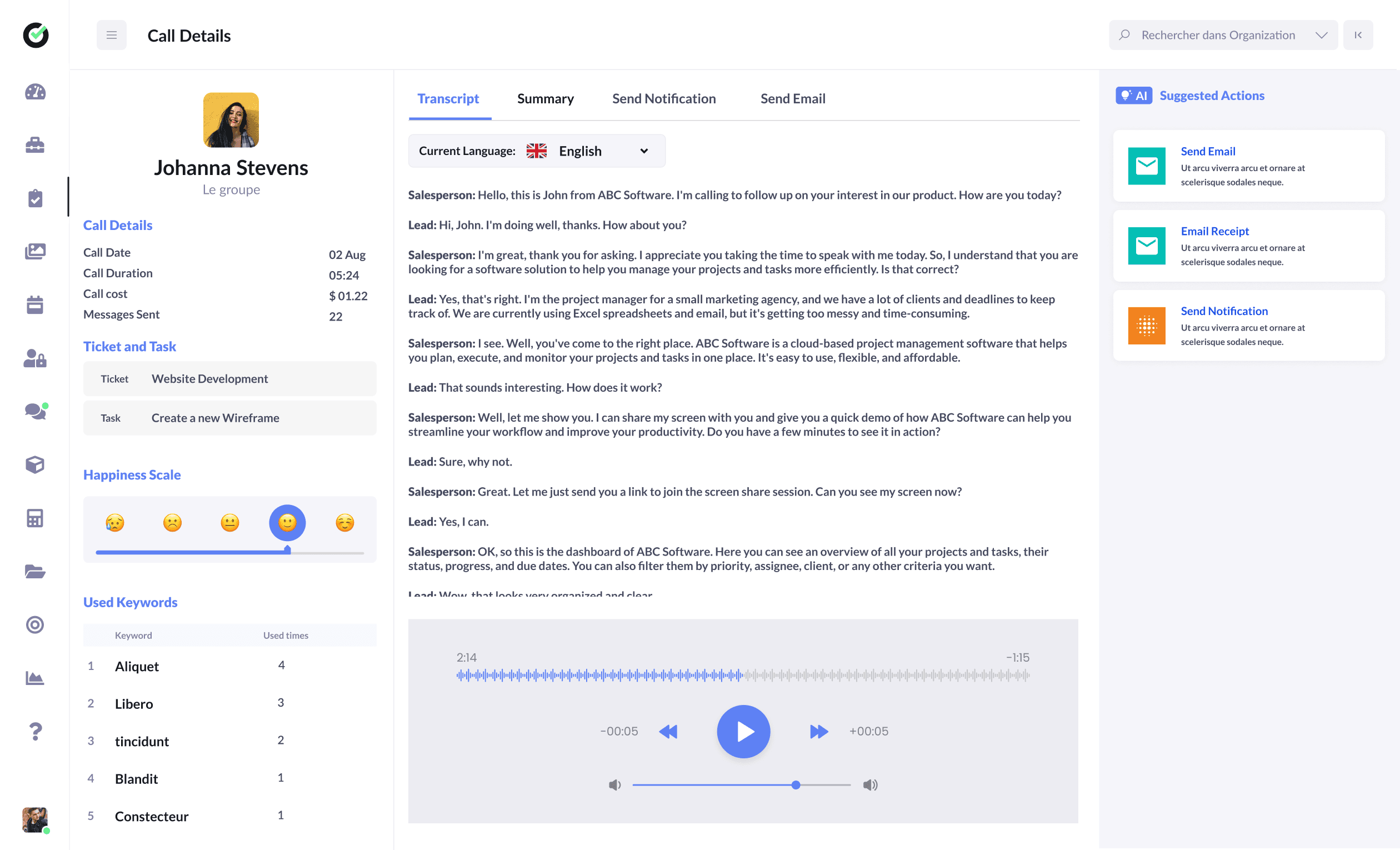
Later work on the V3 foundation includes voter analytics, canvassed-contact history, membership and donation forms, and AI-assisted call review with transcripts and suggested actions.
- 7,000+ active users across the platform
- 1,500+ political parties onboarded
- 4.8/5 mobile app store rating
 After (V3)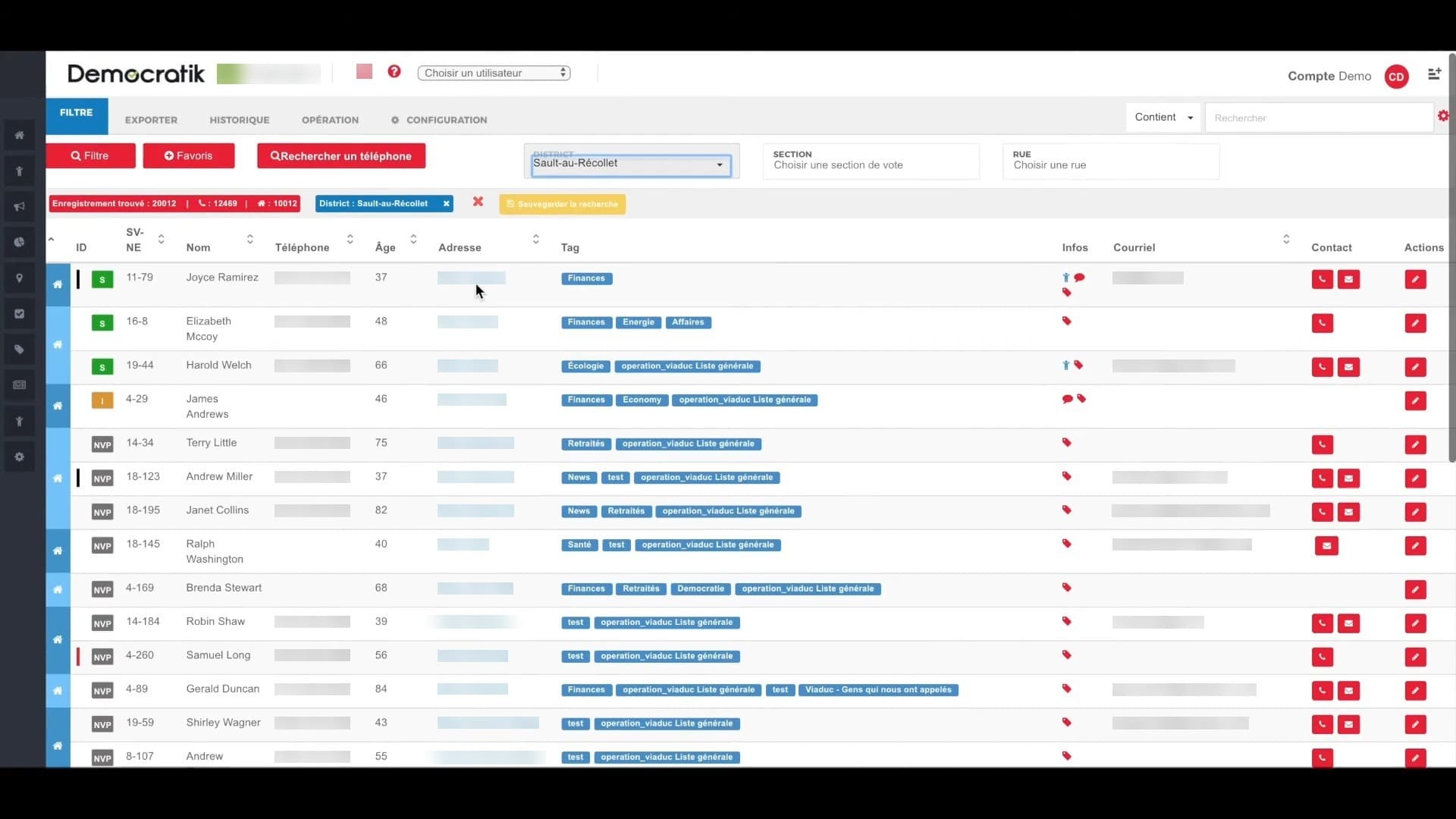
Reflection & Advisory Role
Sustaining design quality over time
After moving from full-time Lead UX Designer to an advisory role, I still support Democratik on strategy, design reviews, and consistency, using context from both V2 and V3.
The main lesson: civic tech has to respect campaign urgency. A polished flow fails if it adds steps during a GOTV weekend. We checked decisions against that reality.
I'm glad we shipped a platform that helps organizers engage communities, coordinate volunteers, and run campaigns that matter. Newer modules like donation forms keep building on the same patterns.